Use this guide as an audit and improvement sequence. You can keep a distinctive visual style: a polished photography portfolio, local business site and editorial publication do not need to look alike. The shared standard is that the design supports the content, the information is accurate and people can complete the task.
Guides Karan Singh BhakuniUpdated 3 Nov 2026
How to Make Your Website Look Professional: A Practical Audit
Karan Singh BhakuniUpdated 3 Nov 2026- 11 min read
- 9 sections
- 3 comparison tables
- 7 questions answered
The short answer
Make your website look professional by making its purpose clear, using consistent typography and spacing, showing credible content and ensuring the important actions work. Start with the page people use most, then fix the same patterns across the site. A template change alone will not repair unclear offers, broken contact routes or unreadable mobile content.
Want the site rather than the reading? Build one free with Grigora
Contents9 sections

Read nextWhy Does My Website Look Different on Mobile Than Desktop?
Audit one real visitor task before changing the design
Choose a representative page and a task: understand a service, compare a product, read an article, find an address or request help. Review it on desktop and a small phone. Record what fails with screenshots, the page URL, device or viewport, expected behavior and the person responsible for the fix.
| Priority | Examples | Why it comes first |
|---|---|---|
| Blocking task or access | Unreadable text, broken menu, failed form, unavailable checkout, content hidden by an overlay. | People cannot use the site or complete the intended action. |
| Unclear or untrustworthy information | Vague service description, stale price, wrong opening hours, unsupported testimonial or claim. | The page may look polished while giving the wrong impression. |
| Inconsistent presentation | Different button styles, uneven card spacing, mixed image crops and heading sizes. | Repeated patterns make the site harder to scan and maintain. |
| Optional refinement | New animations, extra decorative graphics or another font. | Consider only after the core experience works. |
Do not turn the table into a numerical professionalism score. The consequence of a problem matters more than the number of small visual issues. A single failed inquiry route can deserve attention before dozens of spacing adjustments. Keep a before version so you can compare the actual change rather than rely on memory.
Make the opening message specific
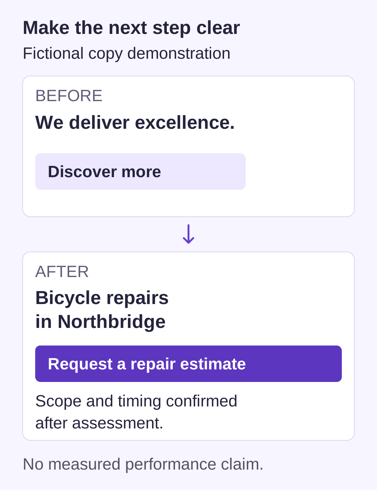
Near the beginning of an important page, explain what the visitor is looking at, who it serves and the useful next step. Replace generic claims such as “innovative solutions for everyone” with accurate service or product information. Explain a restriction or condition when it changes whether the offer is suitable.
| Vague example | More useful example | Why it helps |
|---|---|---|
| We deliver excellence | Bicycle repairs and servicing in Northbridge | A hypothetical repair shop identifies the actual work and location. |
| Discover more | See repair services | The link describes its destination. |
| Book now | Request a repair estimate | The label matches an inquiry rather than implying a confirmed appointment. |
| The best team in town | See completed repairs and customer feedback | The reader can examine relevant evidence instead of an unsupported superlative. |
The repair-shop examples are fictional copy demonstrations, not a business endorsement or evidence of higher conversion. Use only locations, services, availability and credentials that are true for your organization. The website content rewrite guide can help you check an entire page rather than swap a few adjectives.
Set a small, consistent visual system
Define a few reusable decisions before editing every page separately. Choose readable body and heading styles, a restrained set of colors, consistent spacing and recognizable primary and secondary actions. These are design choices, not universal rules requiring exactly two fonts, a particular color or a fixed number of menu items.
- Typography: Establish a clear difference between the main title, section headings, body and supporting text. Test real long titles and paragraphs, not only short placeholder copy.
- Spacing: Reuse a sensible set of gaps and padding. Give related items a visible relationship; keep unrelated sections far enough apart to scan. Align cards, headings and text to consistent edges.
- Color: Use an accent where it helps identify actions or meaning. Do not assume blue automatically creates trust or that a fashionable low-contrast palette is readable.
- Components: Reuse buttons, cards, forms, notices and navigation patterns. Document hover, focus, disabled, loading, success and error appearances where relevant.
Check text against its actual background, including images, gradients and buttons. WCAG’s minimum text contrast criterion generally uses 4.5:1, with 3:1 for qualifying large text and specified exceptions. A palette preview or a screenshot alone does not verify every state. Check the real colors and do not convey an error, selection or required field through color alone.
Apply the system to one representative page first. If it works with a long heading, several cards, an image and a form, roll it out through shared styles or components. Fixing the shared pattern is usually easier to maintain than manually polishing each instance differently.
Use images and proof that earn their place
Choose visuals that explain the offer or demonstrate real work. A relevant product view, annotated example or permission-cleared project photograph can be more useful than a large decorative stock photo. Match crops and image proportions where repeated cards belong together, but do not crop out the information a reader needs.
- Use images you own or have appropriate permission to use. Keep source and license records; the website image rights guide covers the questions to check.
- Size and compress images for their actual display while preserving useful detail. “High quality” does not mean uploading the largest original file everywhere.
- Keep essential text in the page. A diagram or screenshot needs suitable alternatives and enough legibility on the smallest intended layout.
- Remove decorative side strips or frames when they squeeze the useful image without communicating anything. Use a clean consistent presentation instead.
- Label concepts, mockups and stock illustrations accurately. Do not present them as completed client projects, real testimonials or evidence of product functionality.
Show real contact information and explain who operates the site. Publish a business location when appropriate to the business and applicable requirements; do not expose a personal home address merely to make the design seem established. Use testimonials, client logos, awards and certifications only with a valid basis and accurate context. A trust badge or professional photograph does not establish competence or security by itself.
Also worth readingMake a Coaching Website: 10 Practical Steps
Make navigation and actions predictable
Use familiar descriptive labels for the pages people need. Keep the current location understandable and use the same navigation patterns across the site. A large archive may benefit from search and useful category pages; a small service site may need neither a complex search tool nor a large menu. Test the structure against actual tasks rather than an arbitrary link count.
Give important pages a clear next step without making every element demand attention. A primary action might be “View plans,” “Read the guide” or “Request an estimate.” Secondary actions should remain available without visually competing with the main task. A link that navigates and a button that submits information should behave as people expect.
Follow the complete interaction. If a person sends an inquiry, confirm that the intended team actually receives it and that the displayed acknowledgment matches the outcome. A request is not a confirmed appointment, accepted quote or completed purchase unless the underlying process really establishes that state. Explain the next step and realistic response expectations.
Forms need persistent labels, clear required fields, helpful validation and meaningful success and failure feedback. Preserve reasonable user input when correcting an error. The W3C’s design guidance addresses clear labels, identifiable feedback, consistent navigation and visible keyboard focus. Do not remove focus outlines for appearance without providing a usable replacement.
Review phones, loading and layout stability
A desktop screenshot is only one state of the site. Inspect narrow and wide windows, long content, enlarged text and important interactive states. Menus, dialogs, consent notices, sticky headers and contact widgets can cover content or controls even when the underlying layout is responsive. Check a real phone where possible, including the on-screen keyboard.
- Can people read the text without shrinking it to fit? Do long titles, tables and image captions remain understandable?
- Can they open and close navigation, reach its links and recover their place? Does the same task work with a keyboard?
- Do images retain their useful content and avoid pushing the main message or next step away?
- Do buttons remain distinguishable and usable, with enough separation for the intended input? Is required information available without hover?
- Does the page jump while fonts, images, banners or embedded content load? Can the interface respond while those resources are loading?
For performance, use measured problems to guide changes. Reduce oversized media and unnecessary scripts, reserve image space and review third-party embeds before buying more hosting. The Core Web Vitals guidance distinguishes loading, interaction and visual stability, and explains that laboratory tests do not replace real-user field measurements. A single performance score does not prove a site works for every visitor or determine its search ranking.
Do not lazy-load every image indiscriminately; prioritize the content needed for the initial view and defer less important media appropriately. Keep autoplay effects and complex motion optional and controllable. For a deeper layout review, use the mobile-friendly website guide.
Check the pages and states visitors actually encounter
| Check | Evidence to collect |
|---|---|
| Purpose and content | A new reader can explain what the page offers and identify an appropriate next step. |
| Consistency | Shared headings, spacing, buttons and cards follow the agreed design across representative pages. |
| Accessibility | Keyboard focus/order, readable contrast, labels and media alternatives have been reviewed; additional required checks have an owner. |
| Mobile | Important content and controls remain usable with a narrow viewport, enlarged text and relevant overlays. |
| Interactions | A controlled test reaches the correct destination; success, failure and empty states accurately describe what happened. |
| Trust and accuracy | Contact details, dates, offers, credentials, testimonials and policies match the real organization and processes. |
| Recovery | Broken or unavailable destinations have useful help; ownership and update responsibilities are clear. |
Record which browsers, devices and assistive technologies were actually tested. Automated checks can find some defects, but a passing score is not proof of complete accessibility, security or usability. The website bug-testing guide provides a way to document a reproducible problem and verify a fix.
Choose manageable improvements and keep them maintained
A good existing theme or builder can be enough for a straightforward site if you keep its styles coherent and test the real content. Grigora’s public website tools can be considered for that work; verify the current product and plan for the features you need. An AI-generated page still needs fact, rights, layout and interaction review before publication.
Hire specialist help when the remaining problem requires expertise you do not have: brand design, complex interactions, accessibility, performance, integrations or security. Give the person a concrete issue list, representative pages and acceptance checks. Specify ownership, scope, revisions, handover and maintenance rather than buying an undefined “professional look.”
After publishing, review changes when an offer, contact route, staff member, integration or design pattern changes. Remove stale promotions and fix broken links promptly. Use a small change log and the website update guide to keep the experience coherent. Improve the observed task or defect; a new visual trend is not by itself a reason for another redesign.
Professional website design FAQs
Fix anything that blocks a real visitor task, including unreadable content, broken navigation or a failed inquiry route. Next clarify the message and correct inaccurate information, then standardize the repeated design patterns. Decorative refinements come after those issues.
Not always. A suitable theme or builder can work well for a straightforward site when the actual content, styles and interactions are tested. Custom work is useful when your requirements need it and you can support the ongoing maintenance.
Use a small coherent system that supports the content and readable hierarchy. One or two families and a restrained palette can be a practical starting point, not a universal rule. Check real content, contrast and interactive states rather than a font count alone.
No. Add evidence and actions where they serve the task and are accurate. A reading page may need a next-article link; a service page may need an inquiry route. Do not invent testimonials, client logos or functionality to fill a template.
Clear useful content and a usable site can support search work, but visual polish alone does not guarantee indexing, ranking, traffic or sales. Measure actual discovery and visitor tasks separately; do not treat a design or performance score as a ranking prediction.
No. HTTPS protects the connection in transit, but security also depends on accounts, software, permissions, data handling and operations. A padlock or trust badge is not proof that the operator is legitimate or that the site is free of vulnerabilities.
Verify the representative tasks and relevant page states with controlled tests. Check content accuracy, consistency, mobile layouts, keyboard use, form receipt and error handling. Record actual coverage and unresolved issues, then maintain the shared patterns after release.
Practical writing on building a site, growing an audience and sending email people open. No more than one a week.

Karan Singh Bhakuni
118 articles on the Grigora blog
More on Guides

Guides
Why Does My Website Look Different on Mobile Than Desktop?
A phone gives your page a window about 360 to 414 CSS pixels wide, so the layout rearranges on purpose. What changes at each layer, which differences are real bugs, and how to check your own URL.
23 Sept 202617 min read
Guides
Make a Coaching Website: 10 Practical Steps
Help prospective clients understand the coaching, decide whether it fits, and take an accurately described next step. Plan ten practical steps from offer and pages to privacy, scheduling, payment…
15 Sept 202311 min read

Guides
How to Make a Landscaping Website: 11 Practical Steps
Plan a website for landscape design and installation: explain the actual work, show completed projects honestly, help customers check fit and route estimate requests clearly. Follow eleven steps with…
13 Sept 202312 min read