Free Meta Viewport Checker
Check a live page
Enter a public http or https URL. The page is fetched on our side, so you get the markup the crawler sees rather than what a script builds afterwards.
Paste your page source
Staging, a local build or a template. Nothing leaves your browser on this path.
Enter a URL, or paste a page source, and see whether the meta viewport tag is correct. The check reports the exact content string, flags a missing width=device-width, a wrong initial-scale, blocked zoom and duplicate tags, and explains what each one does on a phone. Tag fine but the page still breaks on phones? Our guide on how to make a website mobile friendly walks through the seven fixes in priority order.
Tag fixed? The rest of the page matters too
A correct viewport tag is one line of a mobile site.
Grigora publishes sites that are responsive by default, with width=device-width set, zoom left enabled and breakpoints handled for you, so this check passes on every page without anyone remembering to add a meta tag.
How to check a meta viewport tag
Four steps from a URL or a paste to a clean result.
Enter the page URL
Any public http or https page. It is fetched on our side, so the same origin policy does not get in the way.
Or paste the markup
For a staging page or a template that is not live yet, use view-source, copy the head, and paste it instead.
Read the findings
Each one names the directive, what it does on a phone, and the exact edit that fixes it.
Fix and re-check
Apply the fixes, publish, then run the URL again to confirm every finding cleared.
How to check the meta viewport tag, step by step
Real screenshots of the tool, taken while checking a live page.
- 1
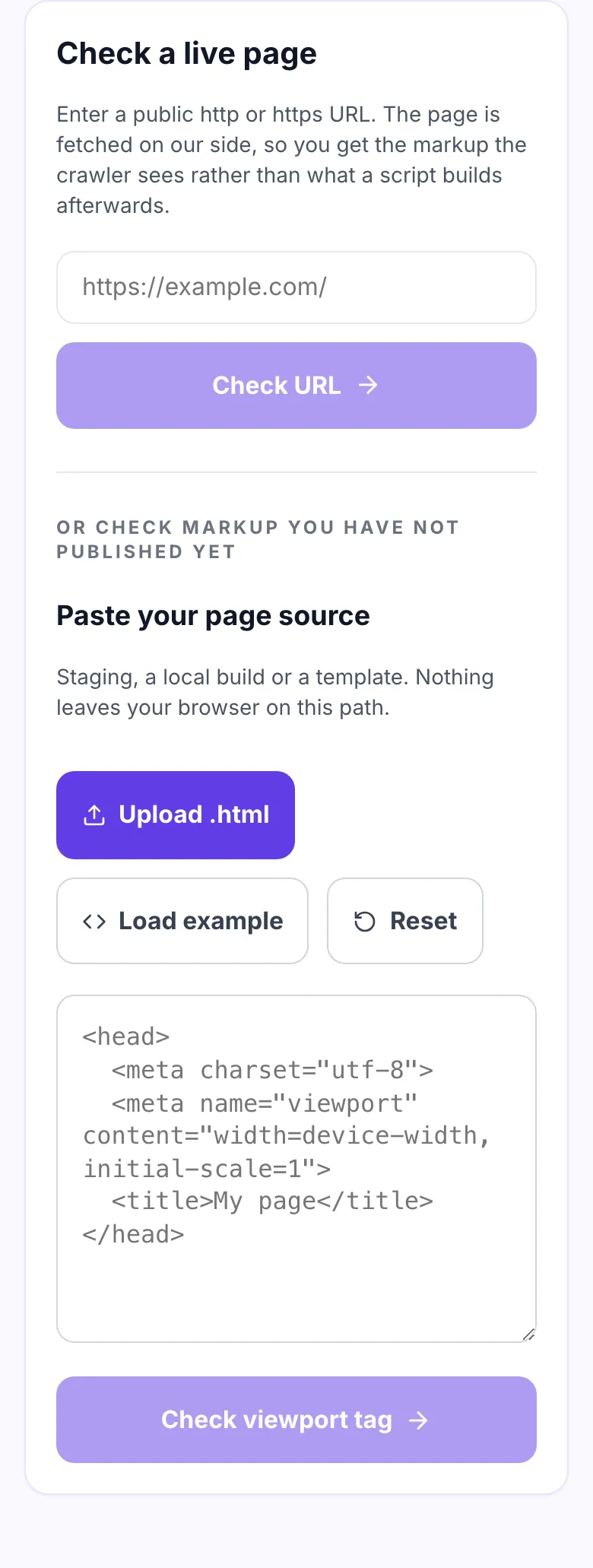
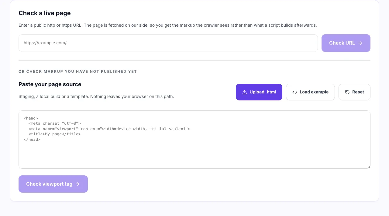
Enter a URL or paste the head
Both routes run the same checks, so a local template and a published page are graded identically.
- 2
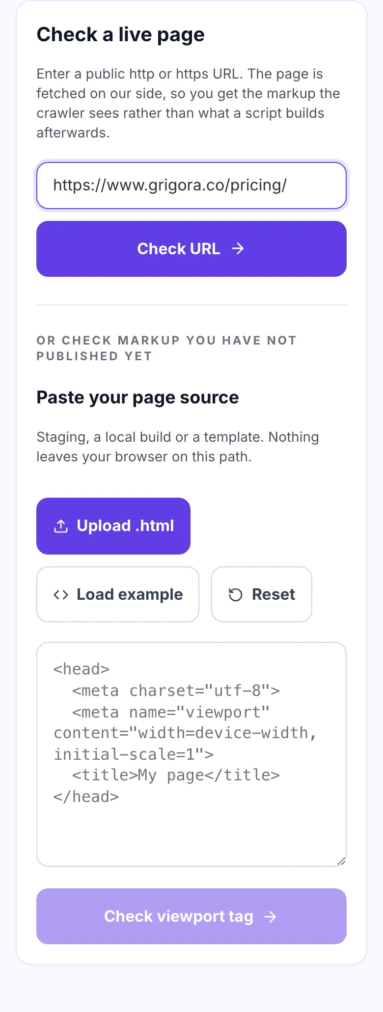
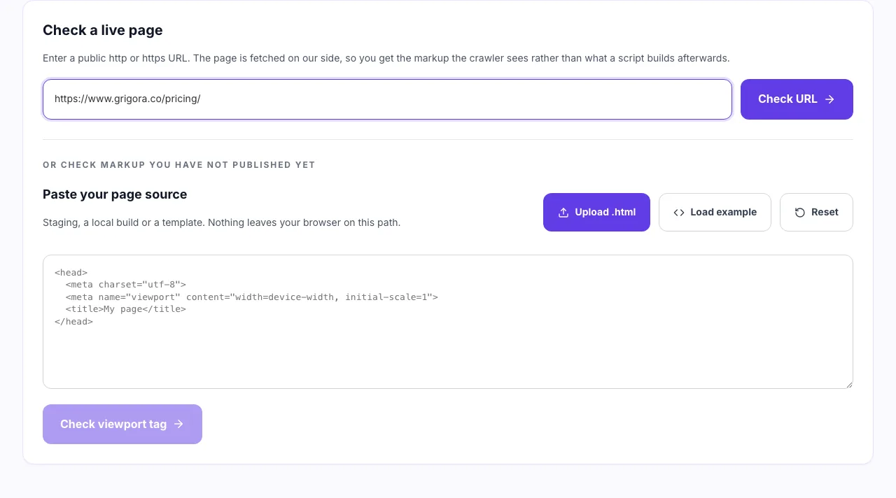
Point it at the page to test
Check one template rather than every page. The viewport tag almost always lives in a single shared layout.
- 3
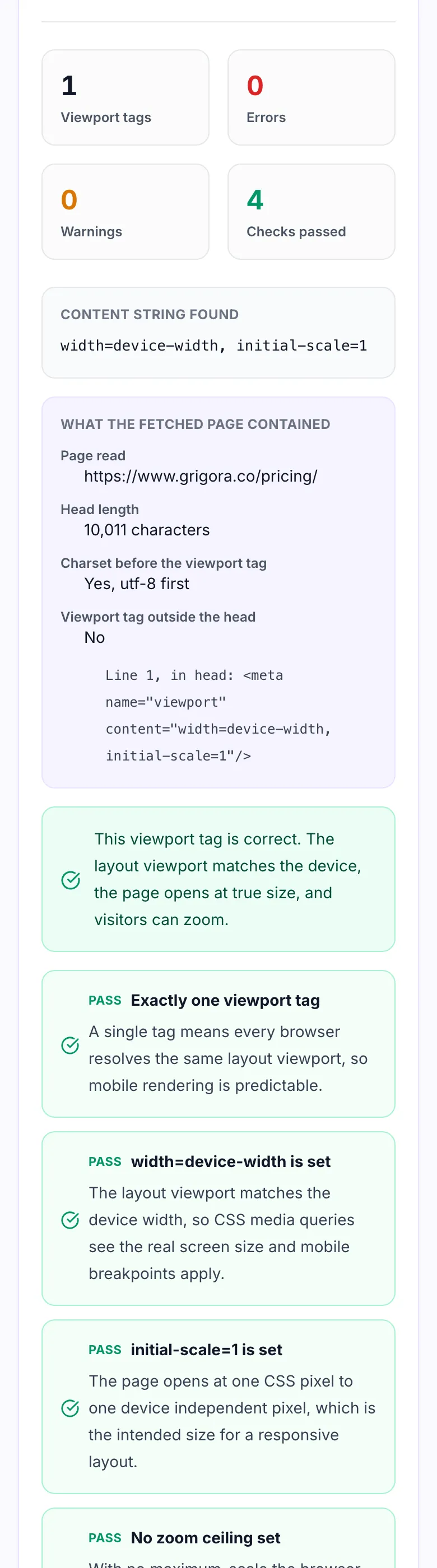
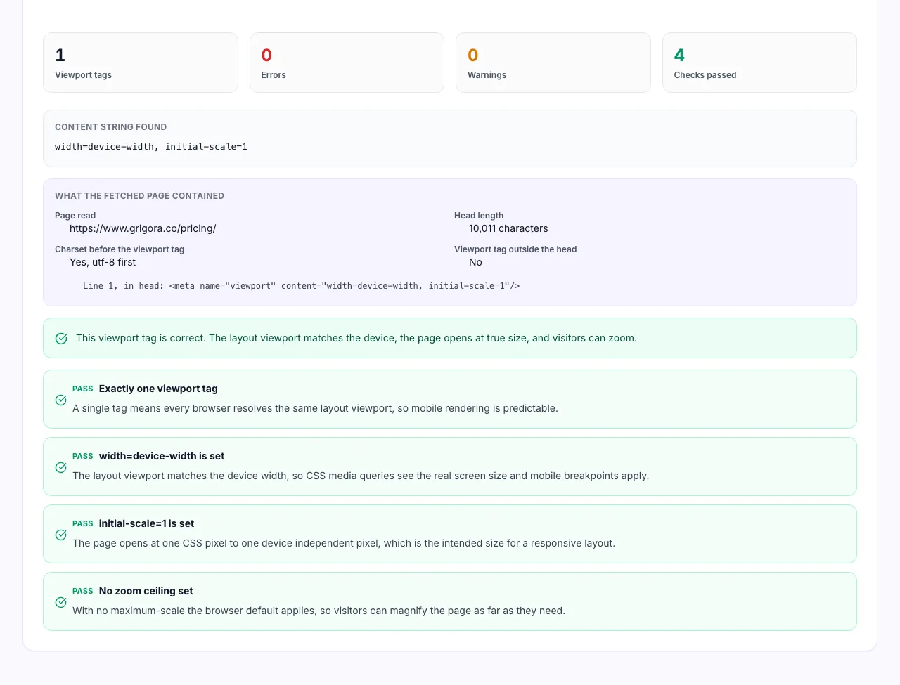
See the tag and the problems with it
It reports duplicate tags, tags sitting outside the head, and user-scalable=no, which stops readers zooming and fails an accessibility audit.
When people run this check
Six moments the viewport tag turns out to be the problem.
A page that fails mobile usability
Search Console reporting content wider than screen almost always starts at the viewport tag.
Accessibility audits
Blocked zoom is one of the fastest WCAG 1.4.4 failures to find and one of the fastest to fix.
After a theme or plugin update
Themes inject their own viewport tag, which is where duplicate tags come from.
Migrating an old site
Sites built before responsive design often carry a fixed width like 1024 in the tag.
Reviewing a developer handover
Check the tag before signing off, not after the client reports tiny text on their phone.
Landing pages built in a page builder
Builders sometimes add maximum-scale to keep their layout tidy, which caps zoom.
Where the tag lives on each platform
The file to edit, by platform.
WordPress
- Open the theme header.php file.
- Look for wp_head and for a hard coded viewport meta above it.
- Keep one tag, and remove any second one injected by a plugin.
Next.js and React
- Set the viewport once in _document.js or the app metadata export.
- Remove any per page Head that also sets it.
- View the rendered source to confirm only one tag ships.
Shopify
- Open layout/theme.liquid.
- The viewport tag sits in the head near the charset tag.
- Edit it there rather than in a section or a snippet.
Grigora
- Sites publish with width=device-width and initial-scale=1 by default.
- Zoom is never disabled, so WCAG 1.4.4 is satisfied out of the box.
- Run your published URL through the check above to confirm.
Grigora vs. other viewport checks
Side by side.
| Capability | Grigora | Online SEO checkers | Site audit suites | Browser audits |
|---|---|---|---|---|
| Accepts a URL or pasted markup | Both | URL only | URL only | Live page only |
| Reports whether charset comes first | Yes | No | No | No |
| Flags maximum-scale under 5 | Yes | Sometimes | No | Yes |
| Detects duplicate viewport tags | Yes | No | No | No |
| Explains the consequence of each finding | Yes | Pass or fail only | Pass or fail only | Short note |
| Works on staging or password protected pages | Yes, paste the source | No | No | No |
| Signup required | No | No | Yes | No |
Common errors and how to fix them
Eight viewport problems that reach production.
No viewport tag at all
Cause: The head was written before mobile mattered, or the tag sits in a template that this page does not use.
Fix: Add <meta name="viewport" content="width=device-width, initial-scale=1"> to the head of every page.
width set to a fixed number
Cause: A desktop layout pinned to 1024 or 1200 pixels.
Fix: Replace the number with device-width and let your CSS breakpoints do the work.
user-scalable=no
Cause: Added to stop double tap zoom on a form or a map.
Fix: Remove it. Use touch-action in CSS on the specific element instead of disabling zoom for the whole page.
maximum-scale=1
Cause: Copied from an old iOS web app snippet.
Fix: Delete the directive. Anything under 5 flags in accessibility audits, and under 2 fails WCAG 1.4.4.
Two viewport tags
Cause: One in the base template, one added by a theme or a plugin.
Fix: Keep the template tag and remove the injected one. Search the whole output, not just your layout file.
initial-scale missing
Cause: The tag only sets width.
Fix: Add initial-scale=1 so the page opens at true size and does not rescale after a rotation.
Typo in a directive
Cause: initial_scale or maximum_scale with an underscore.
Fix: Directives use hyphens. A misspelled directive is silently ignored, so the setting simply never applies.
Tag added by JavaScript
Cause: The tag is injected after load by a script.
Fix: Put it in the server rendered HTML. A viewport applied late causes a visible reflow and can be missed by crawlers.
Viewport numbers worth knowing
The four values behind every finding above.
Frequently asked questions
Eleven answers about the meta viewport tag.
Related free tools
Other utilities that pair with the Meta Viewport Checker.
Mobile Friendly Test
Check the wider set of mobile usability signals on a page.
Try itMobile Preview Simulator
See how a layout behaves at common phone widths.
Try itAccessibility Checker
Find the WCAG issues that sit alongside blocked zoom.
Try itDuplicate Meta Tag Checker
Spot every meta tag your page ships more than once.
Try itMeta Tag Generator
Build a correct head section including the viewport tag.
Try itContrast Checker
Test colour contrast against the WCAG thresholds.
Try itBuild a site that is mobile ready by default
Website, email and store on one platform, responsive out of the box. Try it free for 14 days, no card needed.
Start building free