About half of all web page views worldwide now come from phones: 49.3% in August 2026, according to StatCounter. And Google now ranks every site by its phone version. Not sure where you stand? Run a free mobile-friendly test on your URL first.
Guides
How to Make a Website Mobile Friendly: 7 Fixes
Karan Singh Bhakuni18 Sept 2026
- 19 min read
- 10 sections
- 2 comparison tables
- 8 questions answered
The short answer
To make a website mobile friendly, use a responsive layout with the viewport meta tag, stack columns on phones, set body text to about 16px, make buttons 44 to 48px with gaps between them, compress images and drop full-screen pop-ups. Then check it with free tools and a real phone (Google retired its own Mobile-Friendly Test in December 2023).
Want the site rather than the reading? Build one free with Grigora
Contents10 sections

Read nextWebsite Audit Cost in 2026: $200–$10,000+ (Pricing)
What is a mobile friendly website?
A mobile friendly website is one people can read and use on a phone without pinching, zooming or scrolling sideways. Text is legible, buttons are easy to hit, pages load quickly and nothing covers the content. Responsive design, where one page rearranges itself to fit any screen, is the usual route.
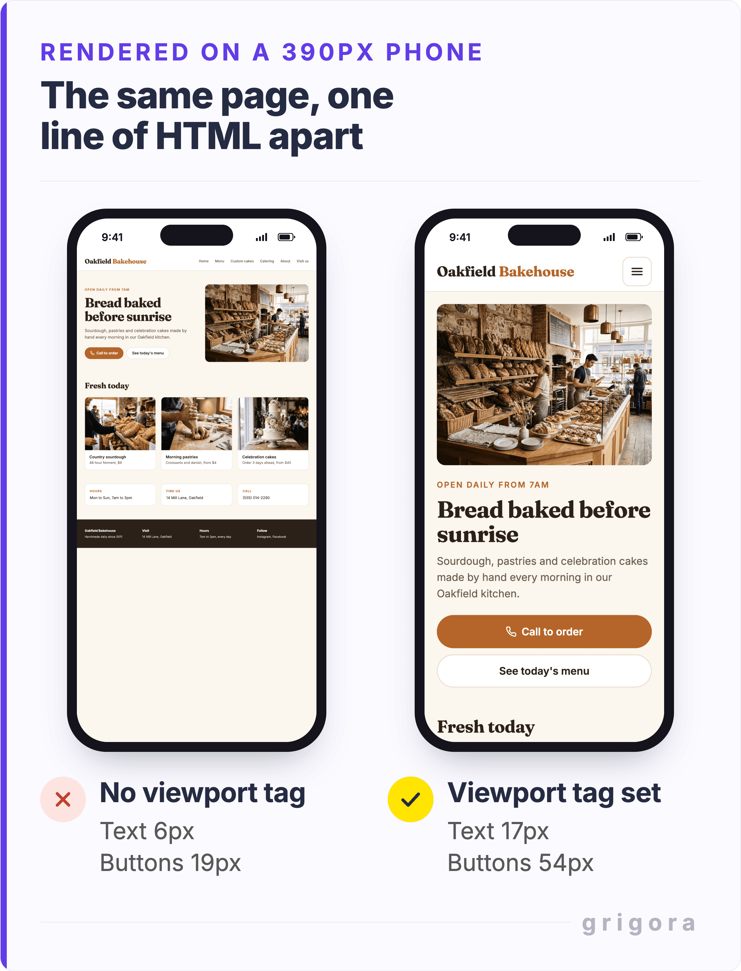
The most basic failure is one missing line of HTML, the viewport meta tag. Without it, a phone lays the page out at desktop width (usually about 980px, according to Google's web.dev) and shrinks it to fit, so nothing is readable without zooming.
Does mobile friendliness affect SEO?
Yes. Google declared mobile-first indexing complete in October 2023, and since 5 July 2024 it has crawled and indexed sites with its smartphone crawler. Content that can't be reached on a phone at all can no longer appear in Google.
Google's Search Central documentation (updated December 2025) says the phone version needs the same main content, structured data, titles, meta descriptions and alt text as desktop. Accordions and tabs are fine, but content you delete on mobile is content Google never sees.
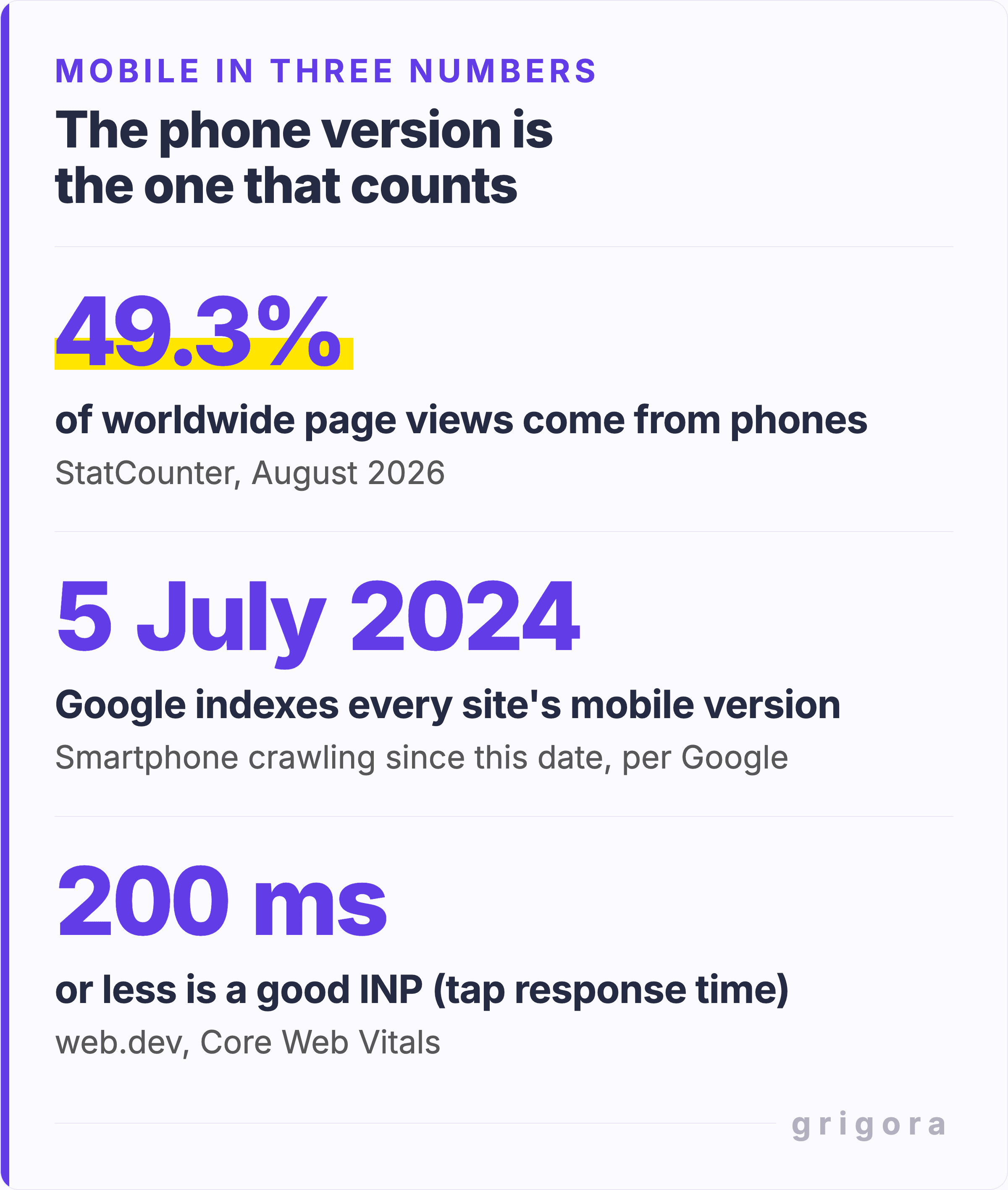
Shares vary by country: in the United States, desktop still led in August 2026 with 55.6% of page views to mobile's 42.3% (StatCounter), so check your own numbers. On Grigora you can add Google Analytics to see your mobile traffic share.
Does it move rankings directly? Partly. Google says Core Web Vitals (three speed and stability scores) "are used by our ranking systems", but other page experience aspects "don't directly help your website rank higher". The bigger cost is lost visitors: Google and SOASTA found in 2017 that as mobile load time goes from 1 to 10 seconds, the chance a visitor bounces rises 123%.
Is my website mobile friendly? Take the 5-minute test
Google retired its Mobile-Friendly Test and the Search Console Mobile Usability report starting 1 December 2023, pointing instead to other tools "including Lighthouse from Chrome". Run this five-minute check on your home page, then on the page that brings in customers: bookings, menu, quotes or products.
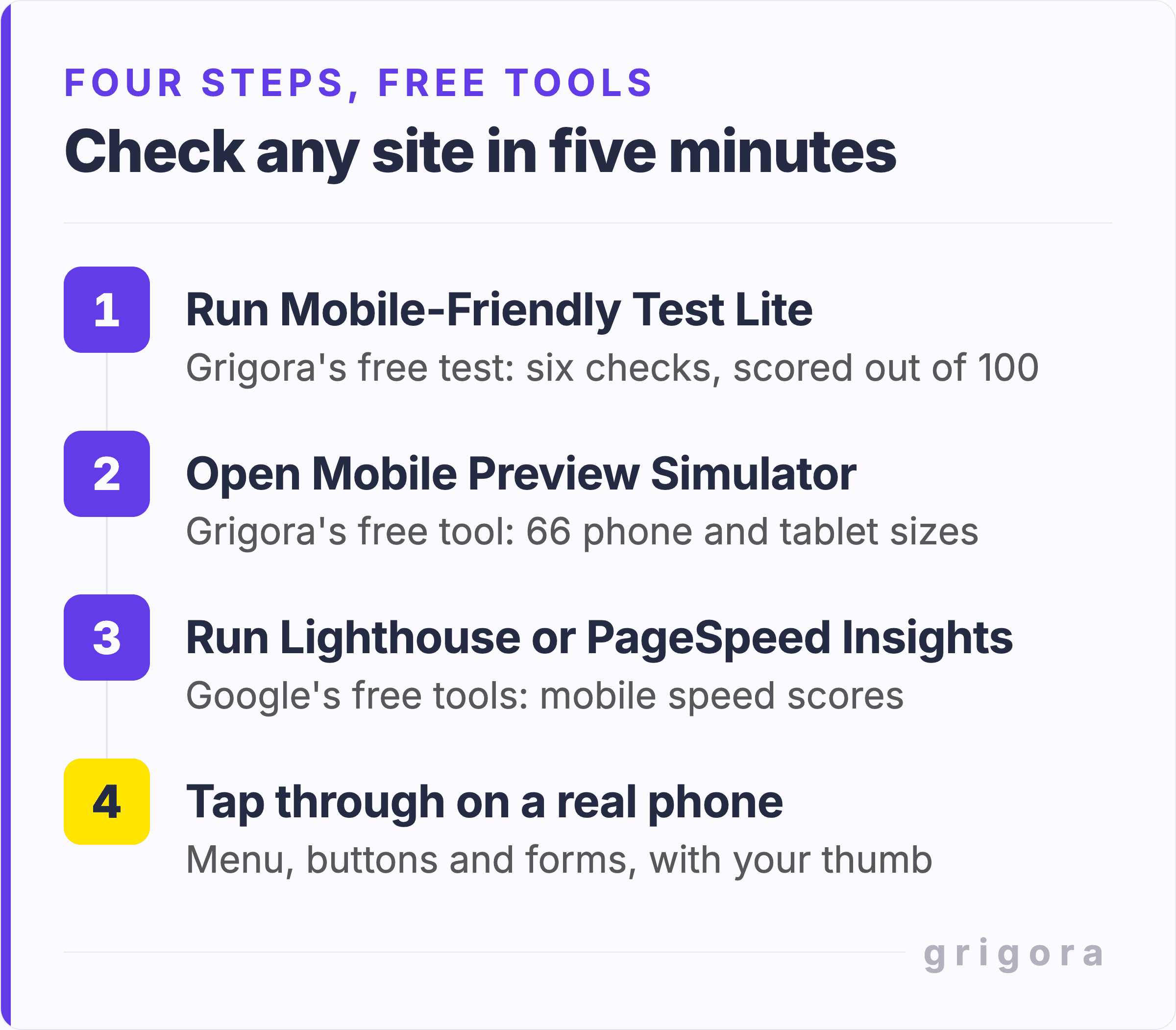
- Minute 1: run a quick scan. Paste your URL into Grigora's free Mobile-Friendly Test Lite. It scores six signals out of 100, such as the viewport tag, fixed widths and small fonts. It reads the page's code without rendering it, so a high score is a pass on the basics, not proof.
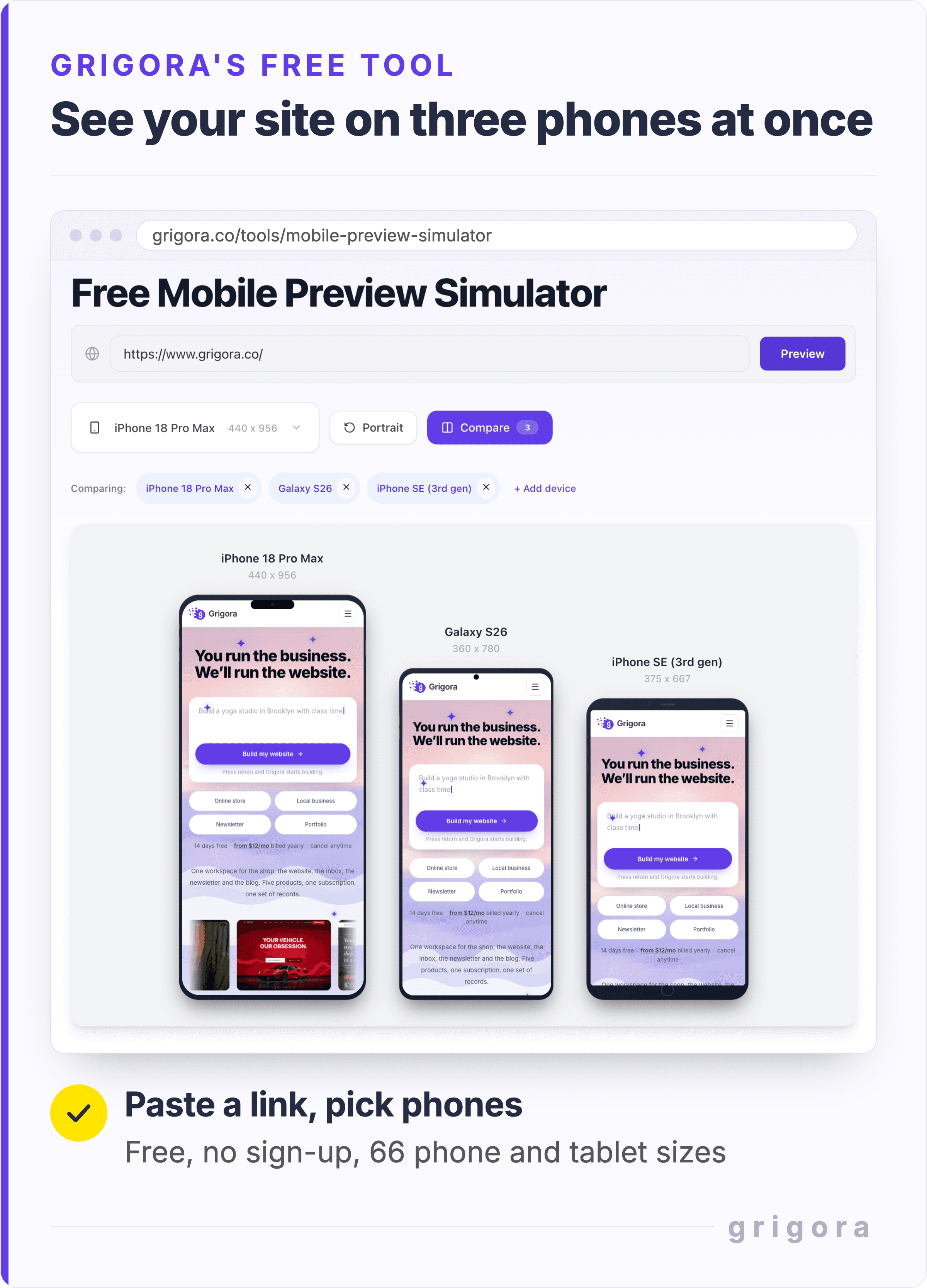
- Minute 2: look at phone screen sizes. The free Mobile Preview Simulator frames your live site at the sizes of 66 phones and tablets. It runs in your desktop browser, so it cannot reveal a missing viewport tag. For a true phone render, or if the preview stays blank, capture a full-page mobile screenshot.
- Minutes 3 and 4: measure speed. Run Google's PageSpeed Insights on the Mobile tab. It pairs a lab test on a simulated mid-tier phone with 28 days of real-visitor data, if your site has enough traffic. Note the LCP, INP and CLS scores (fix 4 explains them); the lab test cannot measure INP, so quieter sites get only LCP and CLS.
- Minute 5: use a real phone. Chrome calls its own phone emulation "a first-order approximation", because a computer cannot copy a phone's processor. On mobile data, tap your phone number, open the menu, start the contact form and turn the phone sideways.
Google Mobile-Friendly Test alternatives: what to use now
| Tool | What it tells you | Best for |
|---|---|---|
| Grigora Mobile-Friendly Test Lite | A score out of 100 for six mobile signals, mostly from the HTML | A fast first pass |
| Grigora Mobile Preview Simulator | Your live page at the sizes of 66 phones and tablets | Spotting layout breaks by eye |
| Lighthouse (Chrome DevTools) | Lab audits of speed, accessibility and best practices | A detailed fix list |
| PageSpeed Insights, Mobile tab | Lighthouse plus 28 days of real-visitor Core Web Vitals, if traffic allows | What real visitors get |
| Search Console Core Web Vitals report | Pages with enough real visits, grouped as Good, Need improvement or Poor | Tracking trends after launch |
| Your own phone | Real touch, keyboard, processor and network | The final word |
After launch, the Search Console report matters most because it uses real visits, though it only lists pages with enough visitor data. Grigora's SEO Report connects Google Search Console for clicks, keywords and top pages; check Core Web Vitals in Search Console itself.
Why is my website not mobile friendly? 12 common problems and fixes
Find your symptom, then read across; the seven fixes below explain each.
| What you see on a phone | Likely cause | Fix |
|---|---|---|
| The page looks zoomed out, with tiny text | Viewport meta tag missing or wrong | Add the viewport tag (Grigora adds it for you) |
| The page scrolls sideways | A fixed-width section, image, table or embed | Let images shrink; scroll wide tables in a box |
| Columns are squashed side by side | The section keeps its desktop layout | Stack the columns in the phone view |
| You have to zoom to read | Body text set well below 16px | Body text of about 16px |
| Pinch-to-zoom does nothing (iPhones ignore this setting) | user-scalable=no or maximum-scale=1 | Remove both |
| Visitors tap the wrong link | Targets too small or too close together | Buttons of 44 to 48px, about 8px apart |
| The main image is slow to appear (LCP) | A heavy or lazy-loaded hero image | Compress it and load it first |
| Content jumps while loading (CLS) | Images without width and height | Set image sizes |
| Taps feel slow to respond (INP) | Too much JavaScript from widgets and trackers | Remove scripts you do not use |
| A pop-up covers the page on arrival | A pop-up set to fill the whole screen | Use a small banner instead |
| Filling in a form is a struggle | Field text under 16px, or plain text fields for email and phone | 16px text, plus the email and tel field types |
| Visitors miss your inner pages | Every link hidden behind a menu icon | Show up to four key links |
How to make your website mobile friendly: 7 fixes in priority order
Your builder may already handle some of these, so tick those off.
1. Check the viewport tag and make the layout fit
The viewport meta tag tells phones to draw the page at screen width, not desktop width. Builders such as Grigora add it for you. In hand-written HTML, it is one line in the head of every page:
<meta name="viewport" content="width=device-width, initial-scale=1">
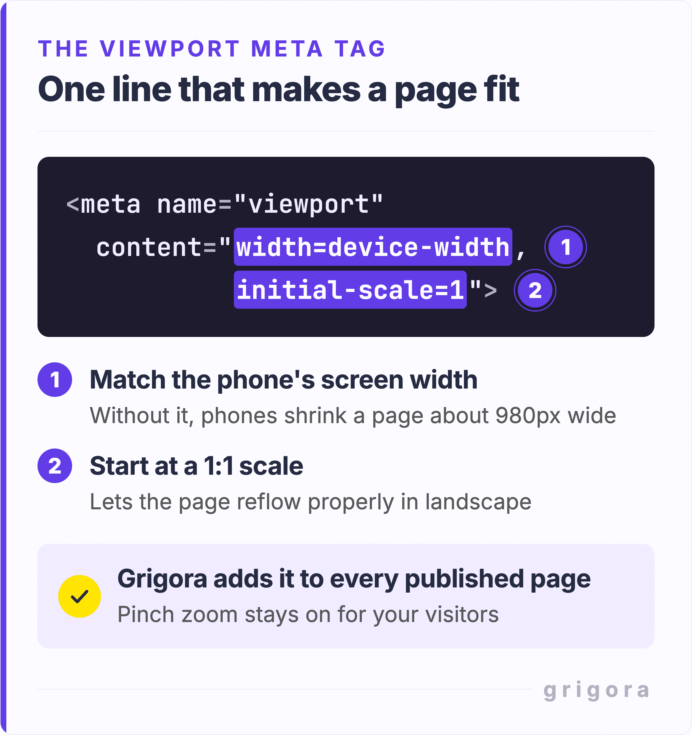
The 2025 Web Almanac found the tag on 95.2% of mobile pages, so check what is inside it, not just that it exists. The meta viewport checker lists every viewport tag on a page and flags a fixed width, blocked zoom or a duplicate tag.
Never block pinch-to-zoom. Some themes add maximum-scale=1 or user-scalable=no. Where browsers obey them, people with low vision cannot enlarge text, which fails the 200% text resize rule in WCAG 2.2, the web accessibility standard. iPhones have ignored them by default since iOS 10, yet 19% of mobile sites still restrict zoom (Web Almanac 2025).
Then make the layout fit. WCAG 2.2 sets the bar: content should work at 320 CSS pixels wide without scrolling sideways. In your builder's phone view, stack multi-column sections, let images shrink and let wide tables scroll in their own box. Rearrange rather than delete.
2. Make text readable without zooming
No Google or WCAG rule sets a minimum font size, but 16px body text is the safe default: it is the usual browser default, it was Google's old PageSpeed advice, and it sits close to Apple's 17pt iPhone body text. Lighthouse dropped its font-size audit in October 2025, so a clean Lighthouse report will not flag small text.
Scale headings down for phones too, or a desktop-sized headline can push your call to action off the first screen. A readability score checker scores how easy your copy is to read, and if whole pages feel heavy, rewrite your website content.
Glare outdoors washes out pale text, so aim for WCAG 2.2's contrast ratio of at least 4.5:1 for body text. Upload a screenshot to the free contrast checker to test your colors. Readable type is also a quick way to make your website look professional.
3. Make buttons easy to tap, and add click-to-call
Fingers are less precise than a mouse, and the standards quote different sizes:
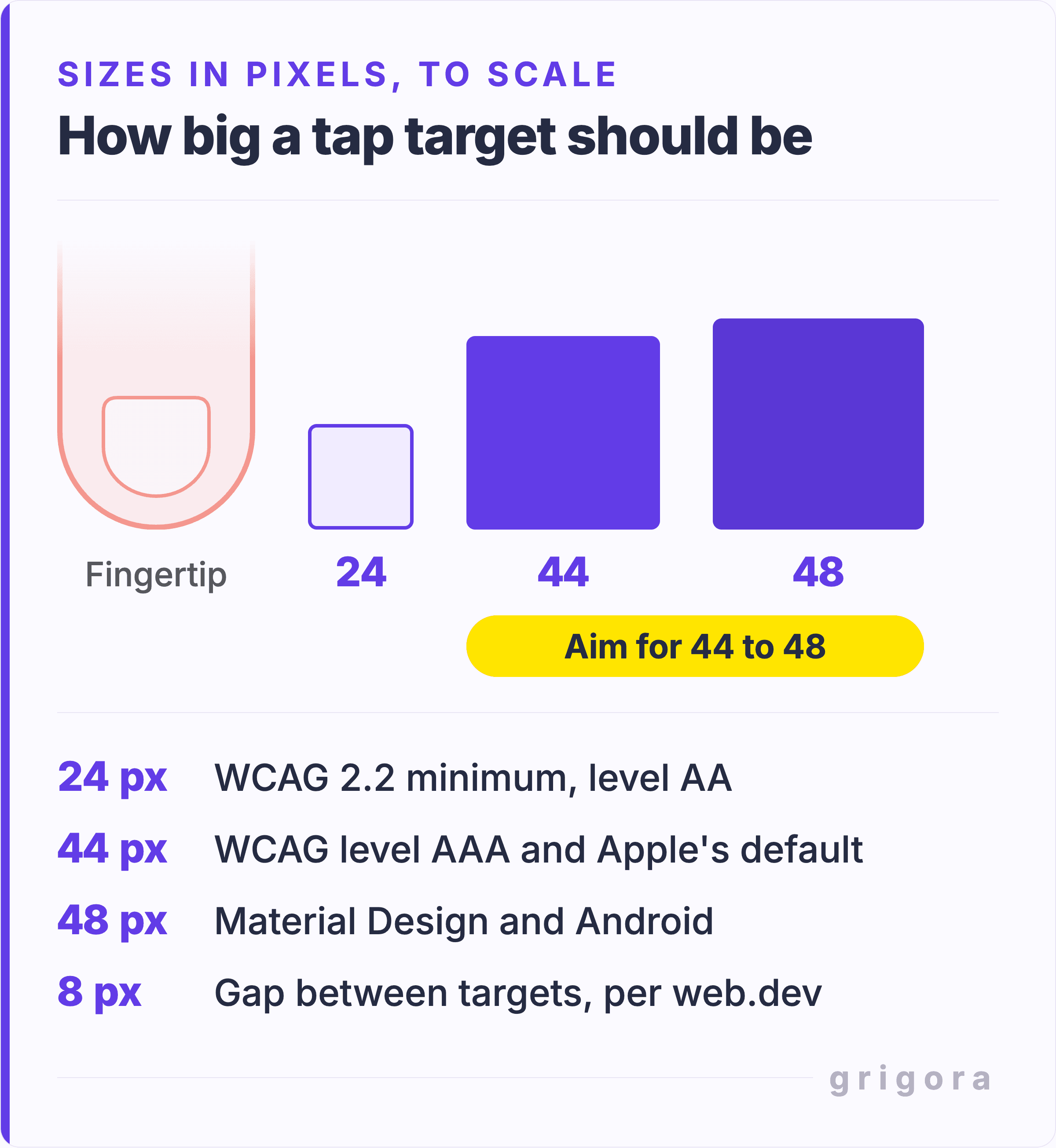
- 24 by 24 CSS pixels: the WCAG 2.2 AA minimum. Smaller targets can still pass with enough space around them, and links inside sentences are exempt.
- 44 by 44: WCAG 2.2 AAA and Apple's default size in points. Apple's absolute minimum is 28, and it treats spacing as seriously as size.
- 48 by 48: Material Design and Android, about 9mm on screen, with roughly 8px between targets per Google's web.dev.
In practice, aim for 44 to 48px with at least 8px between them. To measure your real buttons, run the free accessibility checker with Mobile selected. It flags targets under 24 by 24 pixels without enough space around them and names each element to fix.
Add click-to-call. For a plumber, salon or restaurant, the call is often the sale. Link your number as tel:+15551234567, with the plus sign and country code, so phones dial it in one tap. See how to add a big, tappable button in Grigora, and a button text generator suggests short labels of two to five words.
4. Shrink images and speed up the page
Speed is where more than half of mobile sites fall short: the 2025 Web Almanac found only 48% of mobile websites pass all three Core Web Vitals, against 56% on desktop. To pass, at least 3 in 4 real visits must hit each target:
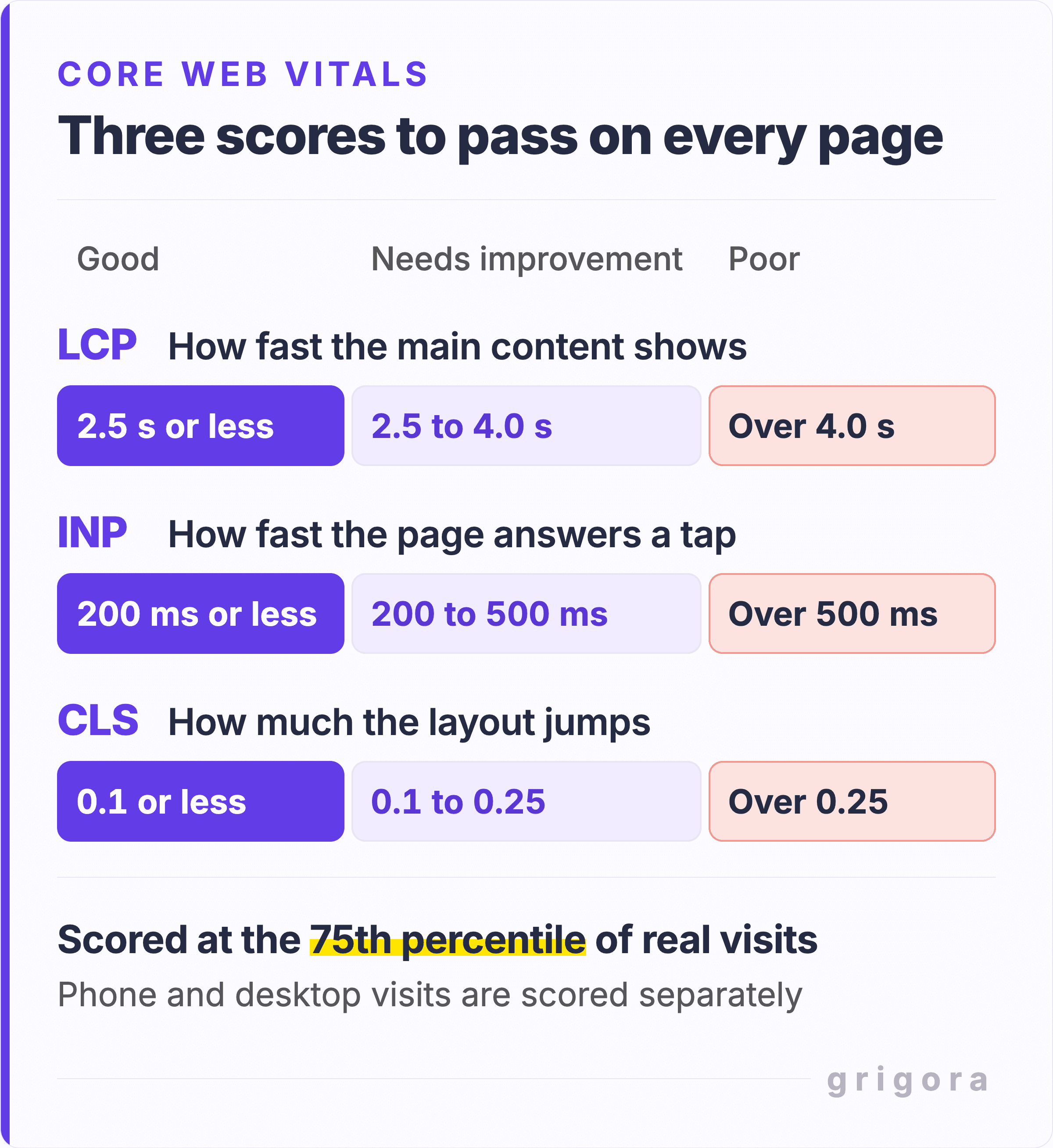
- LCP (Largest Contentful Paint): how fast the main content, often the hero image, appears. Good is 2.5 seconds or less.
- INP (Interaction to Next Paint): how quickly a tap gets a response. Good is 200 ms or less.
- CLS (Cumulative Layout Shift): how much things jump around unexpectedly. Good is 0.1 or less.
Most mobile sites already pass INP (77%, against 62% for LCP), so loading speed is usually the bigger job. The usual fixes:
- Find the heavy images. The broken image checker flags broken images, files over 1 MB and missing alt text.
- Shrink them. Use the free image compressor for photos (it saves them as JPEG) and the WebP converter for logos with transparency. WebP and AVIF work in about 96% and 95% of browsers in use (caniuse, September 2026), so fallbacks are optional.
- Never lazy-load the hero. Lazy loading suits images further down, not the top one, yet about 16% to 17% of pages still lazy-load their LCP image (Web Almanac 2025).
- Give every image a width and height so the page does not jump. A quick page performance check counts images missing them, though it does not measure Core Web Vitals, so confirm in PageSpeed Insights.
- Cut unused scripts. Chat widgets, pop-up tools, old tracking tags and sliders add JavaScript, a common reason taps feel slow.
5. Simplify navigation for thumbs
A hamburger menu (the three-line icon) saves space but hides your pages. In a 2016 Nielsen Norman Group study of 179 people, hidden navigation cut discoverability almost in half. On phones the penalty was smaller: people used a hidden menu in 57% of cases, against 86% when some links stayed visible.
NN/g's advice: with four or fewer main pages, show them. With more, a menu icon is a fair tradeoff if your key pages are also linked from your content. Grigora's guide shows how to build a simple menu that works on phones, and a slim sticky header keeps it in reach while people scroll.
6. Replace pop-ups with small banners
Google warns that pop-ups covering the page "may lead to poor search performance". Use a small banner instead, which Google also suggests for newsletter prompts. Legally required notices, such as cookie consent or age checks, are exempt but should overlay the page, not redirect to another one.
7. Make forms easy to fill in on a phone
Every field is harder with a thumb, so ask only for what you need, then let the keyboard do the work:
- Use the email and tel field types, so phones show an @ keyboard or a number pad. They work in about 97% of browsers in use.
- Set form text to at least 16px. Safari on iPhone zooms into any field with smaller text and does not zoom back out.
If quotes win you work, as they do on a cleaning business website, fill in your own form on your phone, confirmation message included. Selling online? Place a test order on your phone too, on Grigora Commerce or any other store.
Also worth reading30 Tips to Find Bugs on a Website and Squash Them Like a Pro
Make a Grigora site mobile friendly, step by step
If your site is on Grigora, part of the job is done. Every published page gets the viewport tag with pinch-to-zoom left on, phone and tablet settings go live as real responsive layouts, the header menu folds into a menu icon on phones, and photos you upload in the editor become lighter AVIF files with smaller copies for phones.
A few things still need you: multi-column sections can stay side by side on phones until you stack them, a phone text size left blank uses the desktop size, and images lazy-load by default, the hero included. Here is the full pass, in the editor's own labels:
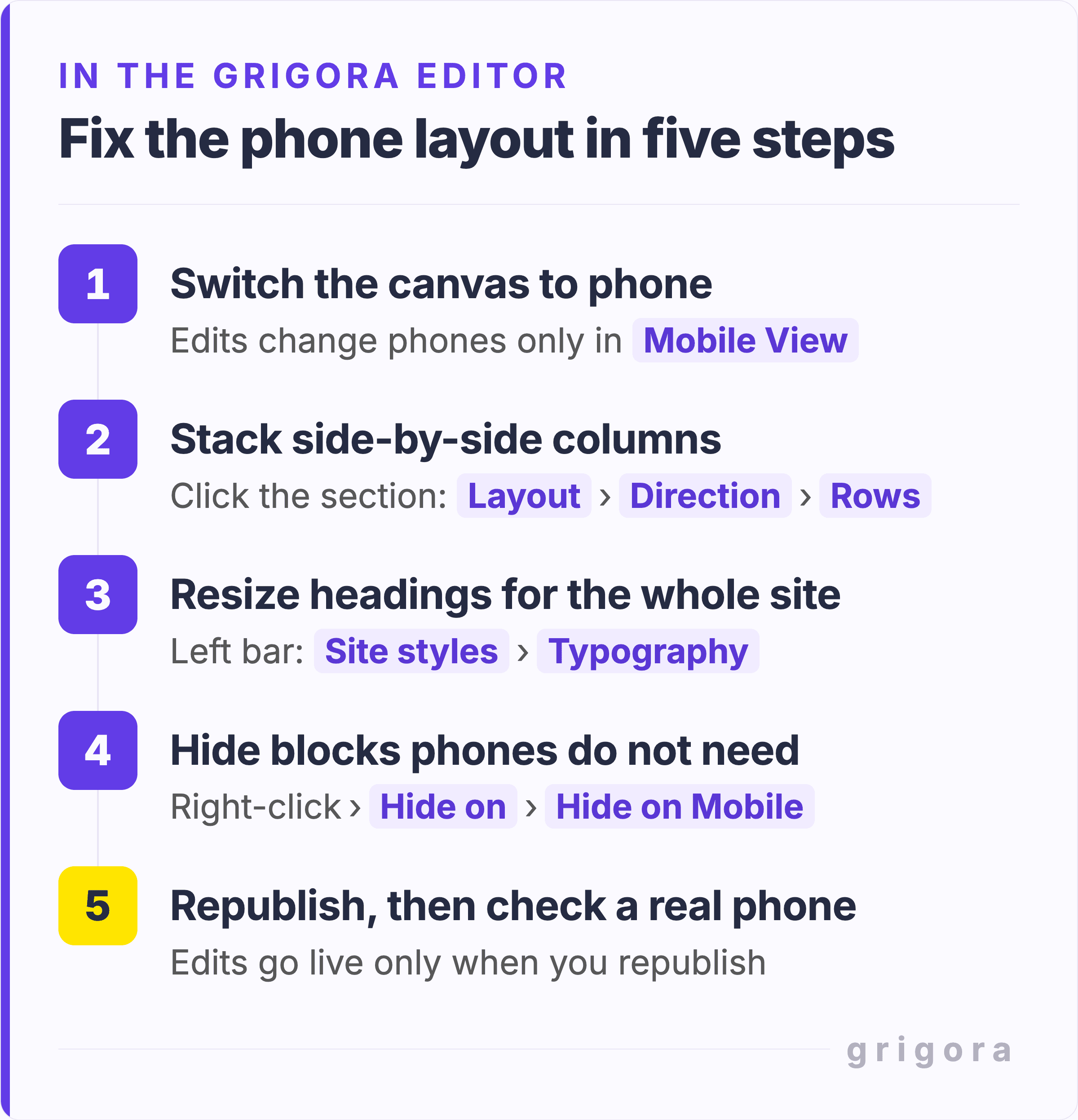
- Switch to Mobile View. Click the phone icon in the center of the top bar; the canvas becomes a 360px phone. Edits change only the device selected here, and the settings panel does not say which, so check it before every edit.
- Stack columns. Click the section, open Layout, then Direction, and choose Rows. Desktop stays as it was.
- Fix text. Under Typography, type a phone Size even if one shows, since the box may display the tablet size (see how to style text in Grigora). For the whole site, open Site styles, then Typography, and set phone sizes for Heading 1, Heading 2 and Body, raising Body from the editor's default of 14px to about 16px.
- Fix buttons. Add padding or height in Mobile View. For click-to-call, keep the link set to URL and type tel: plus your number.
- Hide extras, not content. Right-click a block and choose Hide on, then Hide on Mobile. Google indexes what phones see, so hide decorations only.
- Fix the hero. Click your top image, switch Lazy load off, and fill in Alt Text on every image (see how to add images and videos in Grigora).
- Check menus and forms. The menu becomes a menu icon on phones by itself; for tablets, select the Menu in Tablet View and turn on Use Mobile Navigation. Set form fields' Input Type to Email or Url where it fits; there is no phone option.
- Repeat, then publish. Run the pass in Tablet View, then click Publish, then Save & Publish. Changes go live only when you republish.
For more detail, see Grigora's guide to setting different font sizes, spacing and visibility for mobile, tablet and desktop.
Using Grigora's AI builder?
Grigora's AI website builder creates a site designed for phones, tablets and desktops from a short description. Treat it as a first draft: switch the preview to Phone, and if something looks off, click Annotate the page, draw on the problem and ask the AI to fix it.
Try Grigora free for 14 days, no card needed, then describe your business and let Grigora's AI build a first draft. Or start from one of the responsive website templates, each with a phone preview you can check before you choose.
Optional: how to make a website mobile friendly with HTML and CSS
Skip this if your builder handles the code for you. If you write your own HTML and CSS, these lines cover most fixes above:
- Images:
img { max-width: 100%; height: auto; }plus width and height attributes on every image. - Responsive images:
srcsetandsizes, so phones download smaller files. - Loading order:
fetchpriority="high"on the hero image, andloading="lazy"only below the first screen. - Forms:
type="email",type="tel",autocompleteand 16px text on inputs, plusinputmodewhere no input type fits. - Breakpoints: style the phone layout first, then add a media query such as
@media (min-width: 700px) { .columns { display: flex; } }where your content needs room, not at device widths (web.dev).
On Grigora, the viewport tag is already on every page, so never add a second one through custom code in your site's head. Duplicate tags are exactly what the viewport checker flags.
Outdated mobile advice you can ignore
Many pages that rank for this topic still repeat advice that is now out of date:
- "Run Google's Mobile-Friendly Test." Retired starting 1 December 2023.
- "FID is a Core Web Vital." INP replaced it on 12 March 2024.
- "Over 60% of traffic is mobile." StatCounter's worldwide figure was 61% to 63% from late 2024 to mid 2025, but 49.3% in August 2026.
- "53% of visitors leave after 3 seconds." It comes from a September 2016 Google/DoubleClick report, from the 3G era.
- "You need AMP." AMP hasn't been required for Google's Top Stories since 2021.
- "Google requires 48px tap targets for SEO." Lighthouse swapped that SEO audit for an accessibility check in April 2024.
- "You need a PageSpeed score of 100." Google says chasing a perfect score just for SEO "may not be the best use of your time".
Old desktop-only site? Patch it, rebuild it or hire help
Whether it runs on WordPress, Wix, Squarespace, Canva or hand-written HTML, the checks are the same. Patch it if your editor or theme lets you change the phone layout, because most fixes are then settings, not code.
Rebuild it if it has a fixed desktop width or no phone settings; a responsive template is often faster. See our guides to updating your website step by step and how long a website redesign takes, and Grigora's migration guides for WordPress, Wix and more.
Hire help if you have time for neither: have Grigora's team build it for you, or compare Grigora plans and start from a trade page such as the bakery website builder.
Either way, re-run the five-minute check after each round of fixes. Before launch, work through the interactive website launch checklist, and use these tips to find bugs on your website for testing beyond phones.
Mobile friendly website FAQs
How do I check if my website is mobile friendly?
Open it on your own phone, then run free scans such as Grigora's Mobile-Friendly Test Lite and PageSpeed Insights (Mobile tab). Check that nothing scrolls sideways, text reads without zooming, buttons are easy to tap and, where real-visitor data exists, all three Core Web Vitals are good.
What replaced Google's Mobile-Friendly Test?
Google retired the Mobile-Friendly Test and the Search Console Mobile Usability report starting 1 December 2023, and pointed site owners to Lighthouse in Chrome. PageSpeed Insights adds real-visitor data, and free tools such as Grigora's Mobile Preview Simulator cover quick visual checks.
Does PageSpeed Insights check mobile friendliness?
Partly. Its Mobile tab runs Lighthouse on a simulated mid-tier phone and adds real-visitor Core Web Vitals when your site has enough traffic. Lighthouse checks the viewport tag and tap target size but dropped its small-text check in October 2025, so a good score does not prove text is readable.
Is responsive design the same as mobile friendly?
Not quite. Responsive design is a technique: one page whose layout adapts to any screen width. Mobile friendly is the result: a page that is easy to read, tap and load on a phone. A responsive site can still fail with tiny text, cramped buttons or huge images.
Should I build a separate mobile version of my site?
Usually not. Google recommends responsive design as the easiest pattern to implement and maintain: one URL, one set of content. Separate mobile sites (m.example.com) are still supported, but content, structured data, titles and robots rules must match on both versions, which is easy to get wrong.
What font size is best for a mobile website?
Use about 16px for body text and form fields. No Google or WCAG rule sets a minimum, but 16px is the usual browser default, and Safari on iPhone zooms into form fields with smaller text. Scale headings down for phones and keep contrast at 4.5:1 or better.
What screen width should I test my website at?
Test down to 320 CSS pixels, the width WCAG 2.2 uses for its reflow rule, and check nothing scrolls sideways. Chrome's device mode has presets at 320, 375 and 425px, and Grigora's Mobile View shows a 360px phone. Then finish on a real phone.
How much does it cost to make a website mobile friendly?
It depends on where you start. On a modern website builder, most fixes in this guide cost time, not money. An old fixed-width site usually needs a rebuild on a responsive template, which is where costs climb. The website cost calculator compares agency, freelancer and DIY routes.
Practical writing on building a site, growing an audience and sending email people open. No more than one a week.
KS
Karan Singh Bhakuni
109 articles on the Grigora blog
More on Guides

Guides
Website Audit Cost in 2026: $200–$10,000+ (Pricing)
A website audit costs $200–$10,000+ depending on the type and depth. A basic SEO audit from a freelancer runs $200–$500. A comprehensive multi-category audit from an agency costs $3,000–$10,000+. You…
26 Oct 202310 min read

Guides
30 Tips to Find Bugs on a Website and Squash Them Like a Pro
Introduction The Importance of Bug-Finding Quality is not an act, it is a habit. Aristotle In the digital age, the quality of your website is more critical than ever. Bugs can severely affect the…
25 Oct 20238 min read

Guides
10 Steps to Update a Website Effectively
Introduction Why Updates Matter "The only constant in the technology industry is change." This quote encapsulates why updating your website is not just an option but a necessity. In the fast-paced…
23 Oct 20237 min read