Your website looks different on mobile than desktop because a phone gives your page a window only about 360 to 414 CSS pixels wide, and your CSS is written to rearrange the layout at that width. That is usually responsive design doing its job. It is a fault only when something overlaps, goes missing, or makes the page scroll sideways.
Before you open any CSS, rule out your own phone. Load the page in a private window, then on someone else's phone. If it looks right on theirs, the site is probably fine and the cause is on your phone: the one-phone checklist further down finds it.
If you already know the page is broken and want repairs, not a diagnosis, our guide to making a website mobile friendly lists seven fixes in priority order.
Why does my website look different on mobile than desktop? Seven layers to check
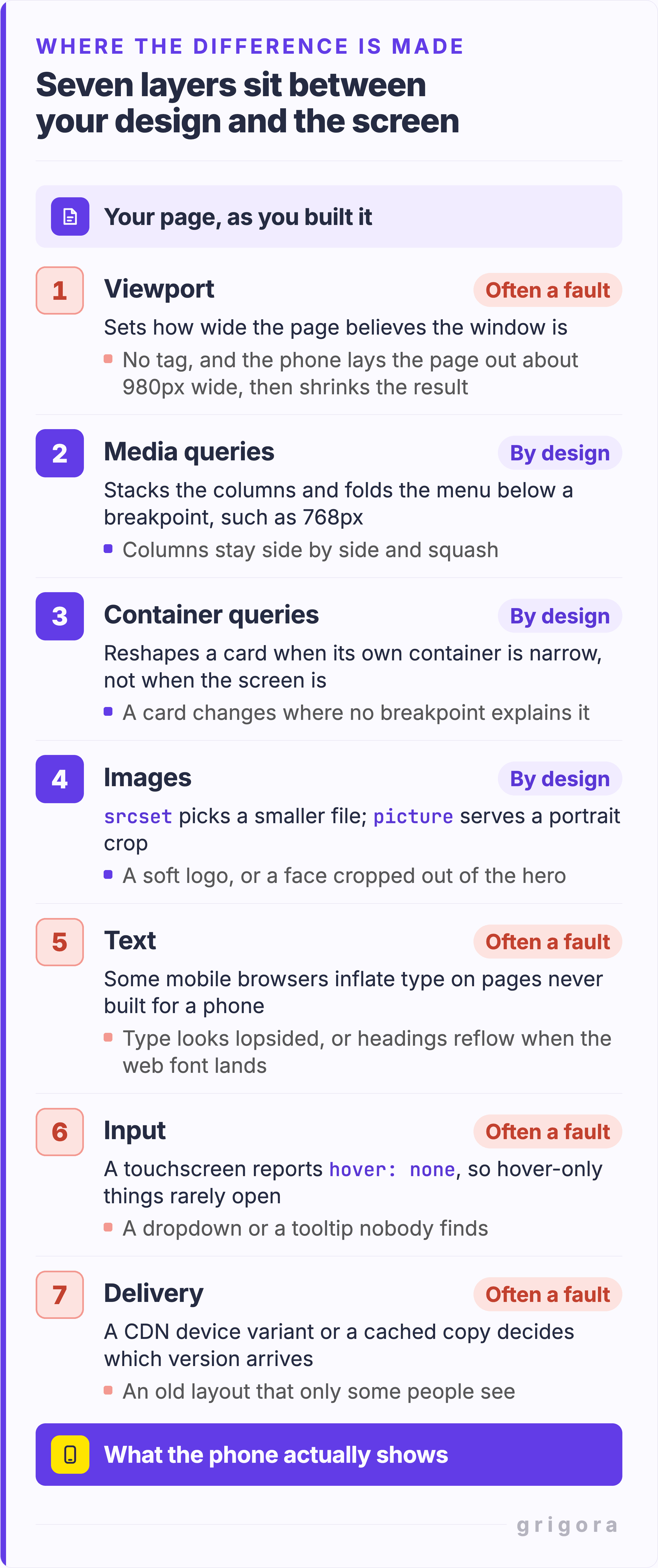
Of the seven layers below, three change the page on purpose. The other four are where faults hide, and a fault in the first can stop the media queries in the second from ever firing.
Layer
What it changes on a phone
Symptom when it goes wrong
1. Viewport
How wide the page believes its window is
The desktop page, shrunk to fit
2. Media queries
Stacks columns and folds the menu below a breakpoint
Columns stay side by side and squash
3. Container queries
Reshapes a block when its container is narrow
A card changes where no breakpoint explains it
4. Images
Picks a smaller file, or a different crop
A soft logo, or a face cropped out of the hero
5. Text and fonts
Inflated type on desktop-only pages, late web fonts
Type looks lopsided, or headings reflow
6. Touch and dark mode
Reports hover: none, and may prefer a dark theme
A menu nobody finds, or dark colors you never saw
7. Caching and delivery
Cache and CDN variants decide which copy arrives
An old layout that only some people see
Each layer is badged by whether a difference there is usually intended or usually a fault.
1. The viewport
The viewport meta tag tells a mobile browser to lay the page out at the real screen width. Without it the browser uses a wider virtual window and shrinks the result: MDN's example is a 640px screen rendered in a virtual viewport of 980px. Media queries written for phone widths never fire, because as far as the page knows, the window is never narrow.
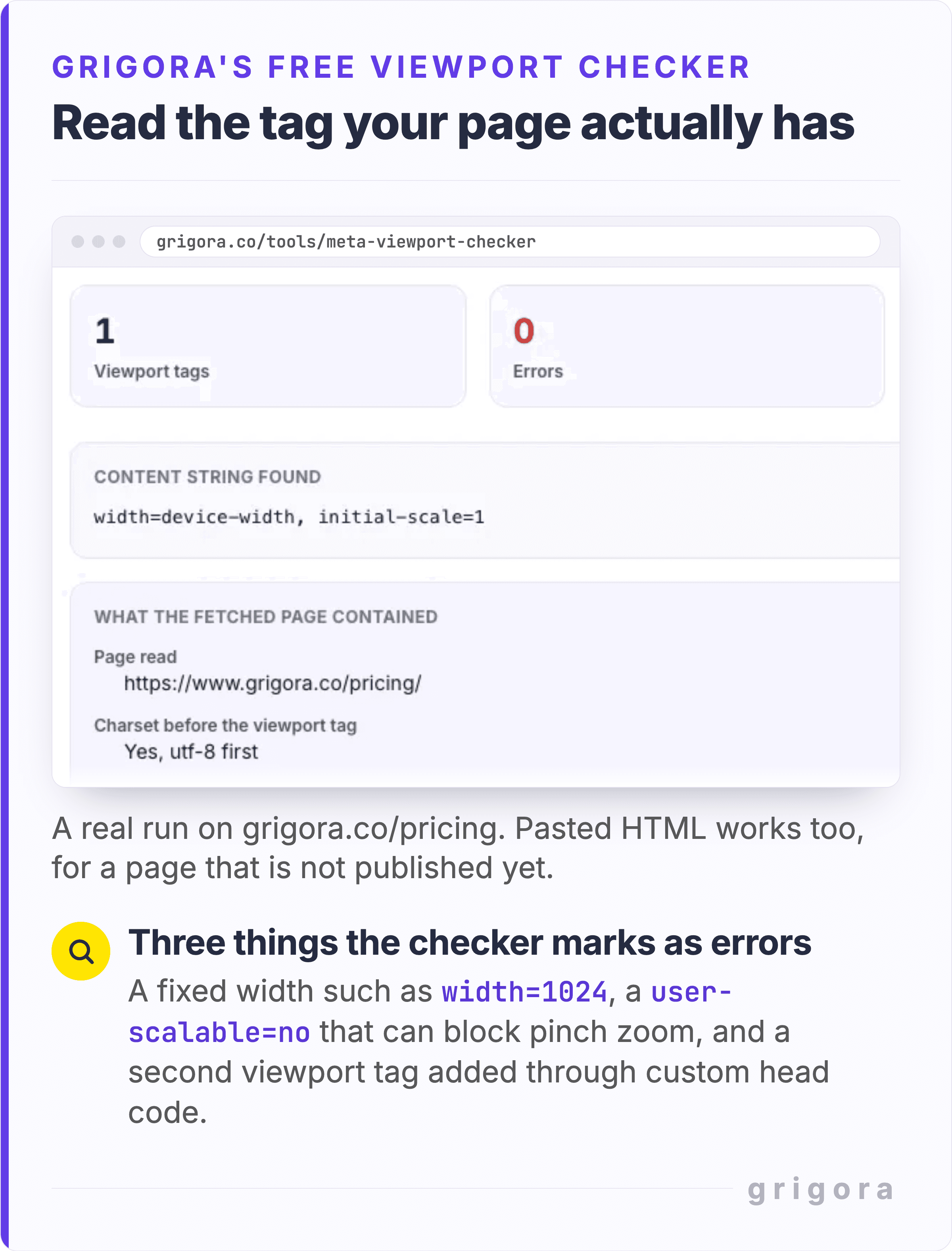
Having the tag proves little, since the 2025 Web Almanac found it on 95.2% of mobile pages. What matters is what it says, and whether there is only one: a fixed width such as width=1024, a user-scalable=no that blocks pinch zoom wherever the browser obeys it, or a second tag added through custom head code. Grigora's free meta viewport checker prints the string it found and flags all three. Re-run it after a theme change or new head code, since either can add a tag of its own.
The checker prints the tag your page actually has. It takes pasted markup too, so a staging build can be read before it goes live.
A phone's address bar expands and retracts as you scroll, but 100vh is sized as if the bar were hidden, so a hero set to 100vh bleeds out of the viewport on load. Use dvh, which follows the bar, or svh, which assumes it is showing. Both work from Chrome 108, Firefox 101 and Safari 15.4.
2. Media queries and breakpoints
This is the layer people mean by responsive design. Below a breakpoint, columns become rows and the navigation folds behind an icon. None of it is a bug: it is a decision somebody wrote down in CSS, and your job is to check it was the one you wanted.
3. Container queries
Since 14 February 2023, size container queries have worked in every major browser engine. They let a block respond to the size of its own container rather than the viewport, so one card can be two columns in the main area and one in a sidebar on the same screen. If a block changes and no breakpoint explains it, search the CSS for @container. If there is none, skip this layer.
4. Images
A phone is often sent a different file altogether. With srcset and sizes the browser quietly picks a smaller version of the same image. With the picture element you can serve a different crop, which is MDN's answer to what it calls the art direction problem: a wide shot with a person in the middle shrinks that person to almost nothing on a phone. A tighter hero crop on mobile is usually somebody solving that on purpose.
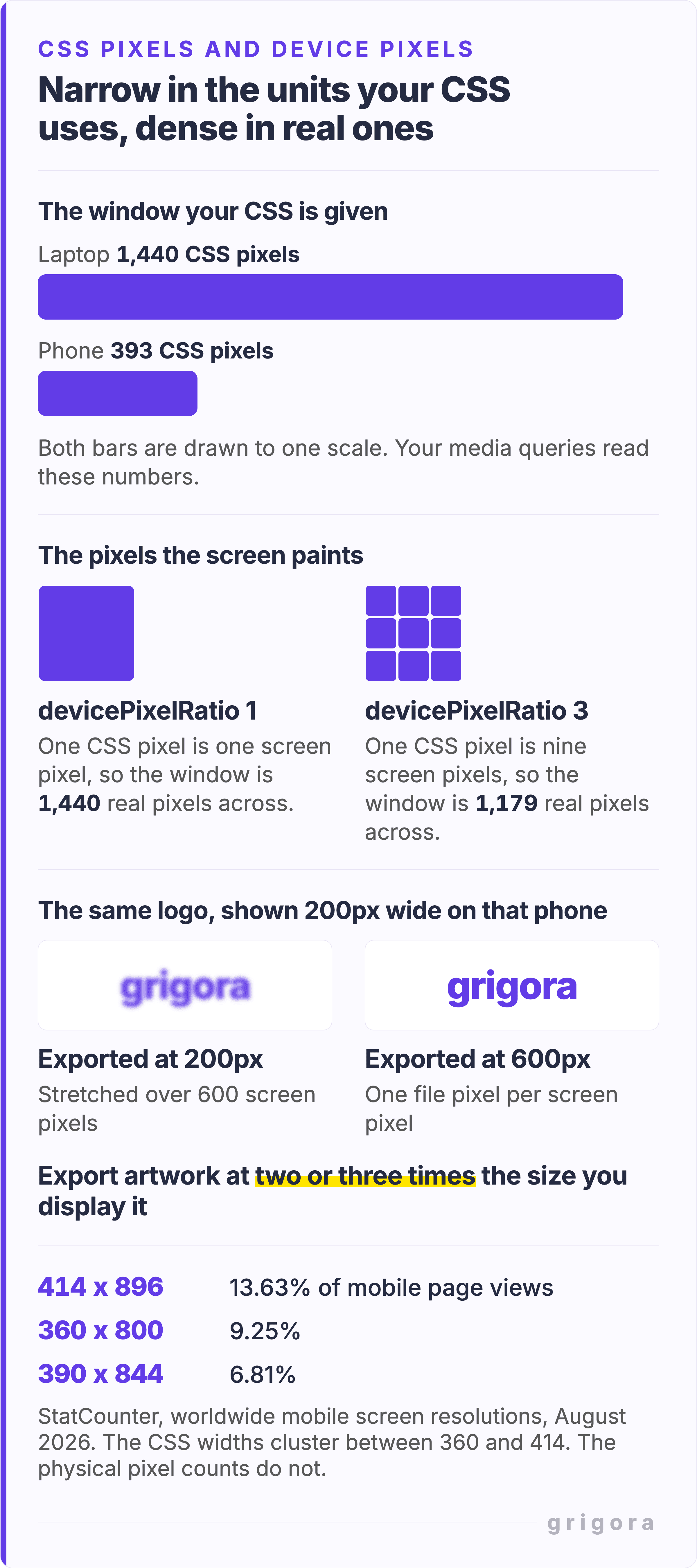
The blurry logo is a different problem. devicePixelRatio is how many physical pixels span one CSS pixel, counted across: 1 on a classic 96 DPI display, 2 on a Retina screen, and often more than 2 on a phone, per MDN. A phone 393 CSS pixels wide at a ratio of 3 paints 1,179 real pixels across, so a logo exported at the 200 pixels it occupies is stretched over 600. Export it at 600, or use an SVG. Photos work out differently, because a file sized for the wider desktop column usually covers the phone as well. Our guide to what size blog post images should be works through the numbers.
Phone screens are narrow in the units your CSS uses and dense in real ones. Export artwork at two or three times the size you display it.
5. Text and fonts
Some mobile browsers run a text inflation algorithm for pages never built for phones. When a block of text spans the full width of the screen, the browser enlarges it without changing the layout around it. So an old desktop site does not look uniformly tiny on a phone. It looks lopsided: some paragraphs blown up, the rest left small.
Web fonts change type on phones too, just later. With font-display: swap the fallback font paints first and the web font replaces it on arrival, which web.dev warns can cause layout shifts. On mobile data you can watch the headings reflow. On office wifi the font has usually arrived before you look, which is why this passes for a phone-only bug.
6. Touch input and dark mode
A touchscreen reports hover: none, which MDN defines as an input that cannot hover at all, or cannot hover conveniently. Anything that appears only on hover, such as a dropdown that opens on mouseover, cannot be relied on for phone visitors. Many phones emulate hover with a long tap, which nobody finds by accident.
Dark mode is the one people forget. prefers-color-scheme reads the light or dark setting in the operating system or browser, and has worked across browsers since January 2020. If your theme ships a dark variant, a phone set to dark shows colors you may never have seen. If it does not, a phone can still recolor it: Samsung Internet's dark mode applies its own color changes to pages without one, and its engineers note that logos and icons can merge into the darker background.
7. Caching and delivery
The last layer is not in your design at all. By Google's definition, a responsive site serves the same HTML to every device, so this layer only bites when something in between keeps separate copies. Cloudflare's cache by device type, part of its WordPress optimization service, is one: it sorts visitors into mobile, tablet and desktop by User-Agent and caches a copy for each. Purge one copy and not the others, and phones keep the old layout. Purge the whole cache before you hunt a bug you have already fixed.
Is it normal for a website to look different on mobile?
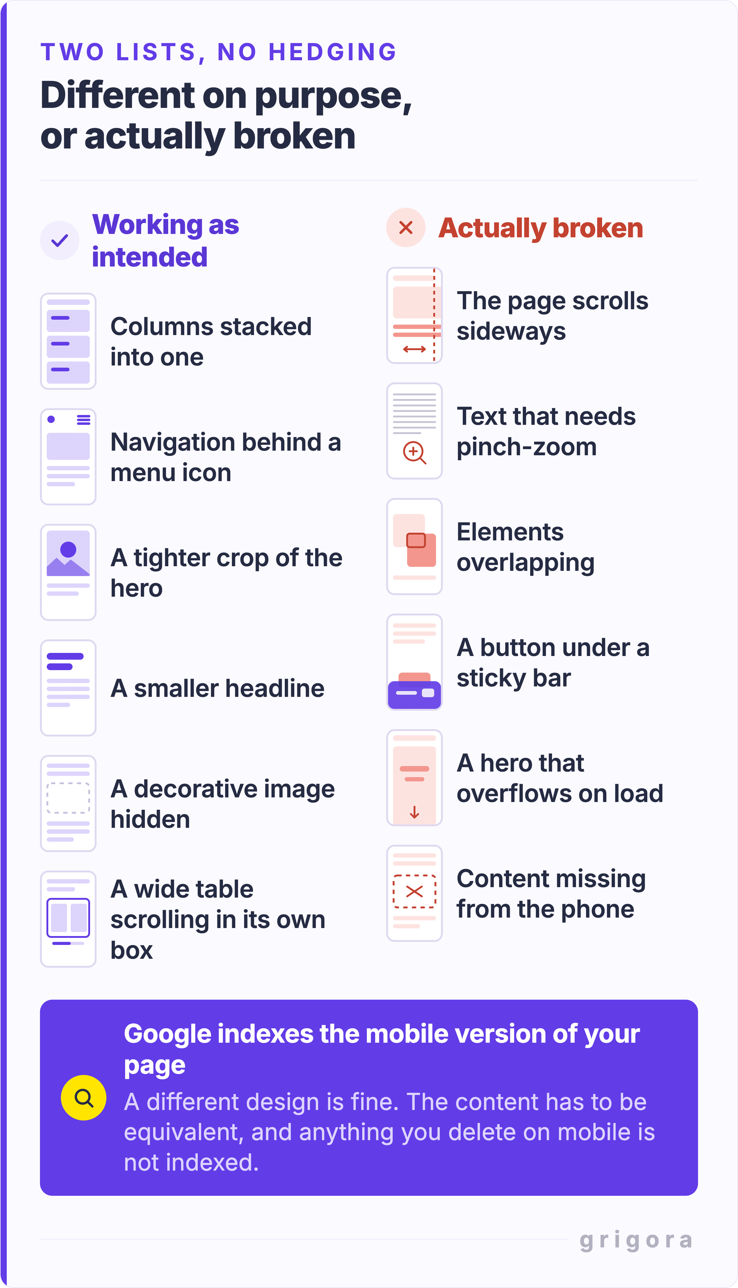
Yes. The test is whether anyone loses something, not whether the layout moved. These differences are working as intended:
Columns stacked into one.
Navigation behind a menu icon.
A tighter crop of the hero, or a different image file altogether.
A smaller headline and tighter spacing.
A decorative image hidden.
A wide table scrolling inside its own box.
These are actually broken:
The page scrolls sideways, or a white strip runs down one edge.
Text that needs pinch-zoom to read.
Elements overlapping.
A button trapped under a sticky bar.
A hero that overflows on load and fits only after you scroll.
Content that is on desktop but missing or different on mobile, such as a price or a call to action.
Six differences to leave alone, six to fix, and the search rule that decides the last one.
That last item has a search consequence. Google indexes the mobile version of your pages, and its mobile-first indexing documentation, last updated 10 December 2025, says where the freedom ends: a different mobile design is fine, accordions and tabs included, but only the content shown on the mobile site is used for indexing, and alt text and structured data must match on both.
Speed is the one difference to judge on its own terms, because phones are usually slower. In June 2025 the Web Almanac found good Largest Contentful Paint on 74% of desktop pages but only 62% of mobile ones. web.dev scores the two separately against the same 2.5 second target, so judge your phone score against that, not against your desktop score.
What screen width should you design for on mobile?
There is no single phone width. In August 2026 the most common mobile resolution worldwide was 414 by 896, at 13.63% of mobile page views, then 360 by 800 at 9.25% and 390 by 844 at 6.81%, according to StatCounter. Nor is mobile the landslide it often gets called: that month it had 49.36% of all page views to desktop's 49.11%. You are building for both.
Run these on your own URL, in order. Each step gets closer to what a real visitor sees.
Read the viewport tag. Run the checker above on your live URL. Anything other than width=device-width, initial-scale=1 with zoom left on gets fixed first.
Get a score. The free Mobile-Friendly Test Lite scores six checks out of 100, flagging tap targets under 48 by 48 pixels and body text under 16px. It reads the code without rendering the page, so a good score is a pass on the basics, not proof.
Look at two or three phone sizes. The free Mobile Preview Simulator frames your live page at iPhone, Pixel and Galaxy sizes, plus foldables and tablets. It cannot load a site that blocks iframing, and it does not simulate touch.
Capture both versions. The free website screenshot generator has presets at Mobile 390 by 844 and Desktop 1440 by 900. Capture the same page at each preset and lay the two side by side.
Finish on a real phone, on mobile data. Open the menu, tap a button, start the form, turn the phone sideways. No simulator tells you the submit button sits under the keyboard.
The same page at 390 and at 1,440. Four things changed, and all four were written into the page on purpose.
It looks wrong on my phone but fine on everyone else's
When one device disagrees with every other device, the cause is usually on that device. Check these on the phone that disagrees.
If the words differ as well as the length, Google has rewritten the title from another source, such as your main heading, and that can happen on any device. It passes over titles that are half-empty, out of date or boilerplate, so the fix is a specific title and one clear main heading, part of the HTML tags worth keeping in a blog post.
How to change the mobile layout in Grigora
A builder takes the first layer off your hands and part of the fourth. Every published Grigora page gets the viewport tag with pinch-to-zoom left on, phone and tablet settings publish as responsive CSS, the header menu folds into an icon, and uploaded photos become AVIF files with phone-sized copies.
The rest is yours. In the editor's own labels:
Switch to Mobile View. The phone icon in the top bar turns the canvas into a 360px phone. Settings that can differ by device, such as direction and text size, then change for phones only.
Stack the columns. Multi-column sections stay side by side on phones until you select the section, open Layout, then Direction, and choose Rows.
Type a phone text size every time, even when the box shows a number. Left blank, the box may show the tablet value while the published phone page uses the desktop one.
Turn Lazy load off on the hero image. Images lazy-load by default, the hero included, which delays the first thing a phone visitor sees.
Hide decoration, not content. Right-click a block, then Hide on, then Hide on Mobile.
Republish. Nothing is live until you do.
If your site has a fixed desktop width and no phone settings at all, the honest answer is a rebuild rather than a patch. Our guide to updating a website covers the order to do it in.
The phone is laying the page out at a desktop width, often about 980 pixels, and shrinking it to fit. That happens when the viewport meta tag is missing or sets a fixed width. Use width=device-width, initial-scale=1, and keep only one viewport tag.
Why does my website look fine on desktop but broken on mobile?
Usually something on the page was built for desktop only: a section with a fixed pixel width, a menu that opens only on hover, or a hero set to 100vh that runs past the screen. Test at 320 CSS pixels, then on a real phone, and open every menu and form.
How do I make my website look exactly the same on mobile and desktop?
You can, by giving the viewport tag a fixed width, but you do not want to. A desktop layout squeezed onto a 390 pixel screen gives unreadable text and buttons too small to tap. Keep the content the same instead, because Google indexes the mobile version.
Why is my logo or image blurry on mobile but sharp on desktop?
Phones pack more physical pixels into each CSS pixel, often more than two to one, so artwork exported at its display size gets stretched. Export images at two or three times the size they appear, or use an SVG for logos.
Why does my website look wrong on my phone but fine on everyone else's?
Check for Request Desktop Website left on, a cached stylesheet, an in-app browser, a content blocker, and Page Zoom. A private window plus one other phone usually settles it within minutes.
Why is there a sideways scroll or a white strip down the side on mobile?
Something is wider than the viewport: an image without max-width: 100%, a fixed-width section, a table, a video embed, or an element pushed out by a negative margin. Open your browser's device mode at 320 CSS pixels, the width WCAG 2.2 uses for reflow, scroll sideways, and look for the element that sticks out past the edge.
Does Google use the mobile or the desktop version of my website?
The mobile one: Google uses the mobile version of your page for indexing and ranking. On a responsive site the HTML is the same on every device, so the risk is only in what you hide or remove on phones. Keep the text, alt text and structured data the same on both.
Get the next guide by email
Practical writing on building a site, growing an audience and sending email people open. No more than one a week.