A common rule of thumb says 1200px wide, 72 PPI, under 200KB. The width depends entirely on your layout, the 72 PPI does nothing at all, and the weight is better set for the whole page than for each image. Measure your own column once and the arithmetic does the rest.
Guides
What Size Should Blog Post Images Be? Widths and KB
Karan Singh Bhakuni23 Sept 2026
- 16 min read
- 10 sections
- 1 comparison table
- 8 questions answered
The short answer
Blog post images should be as wide as your content column multiplied by screen density, capped at 2x. On a 720px column like this blog's, that is a 1440px source file, kept under about 150KB in WebP or AVIF. The featured image is the exception: export it at 1200 x 630, because that same file has to work as your social card.
Want the site rather than the reading? Build one free with Grigora
Contents10 sections

Read nextExact Price to Charge for a Blog Post
What size should blog post images be?
An image in a post is doing one of four jobs, each with its own target. Size all four the same way and the post ends up soft on a laptop and slow on a phone.
| Where the image sits | Source file to export | Weight to aim for | Why |
|---|---|---|---|
| In-post figure | Column width x 2, so 1440px on a 720px column | Under 150KB | A ceiling, not what every visitor gets: the browser picks a smaller srcset copy |
| Featured image at the top | 1200 x 630 | Under 200KB | Often the Largest Contentful Paint element, so load it eagerly, never lazily |
| og:image for the link card | 1200 x 630, the same file | The same file (Meta's hard cap is 8MB) | Meta's minimum is 200 x 200; 1200 x 630 is what it asks for on high resolution screens |
| Thumbnail in a related posts rail | Card width x 2, so about 400 x 300 for a 200px card | Under 40KB | Rails vary, so measure the card the way you measure the column; the median desktop image paints at 216 CSS px |
In the drawing below, pins 1 to 3 sit on the page itself. Number 4 is the featured file again, this time as a link preview, and the strip at the bottom shows what is left of it after a square crop or a 2:3 Pin.
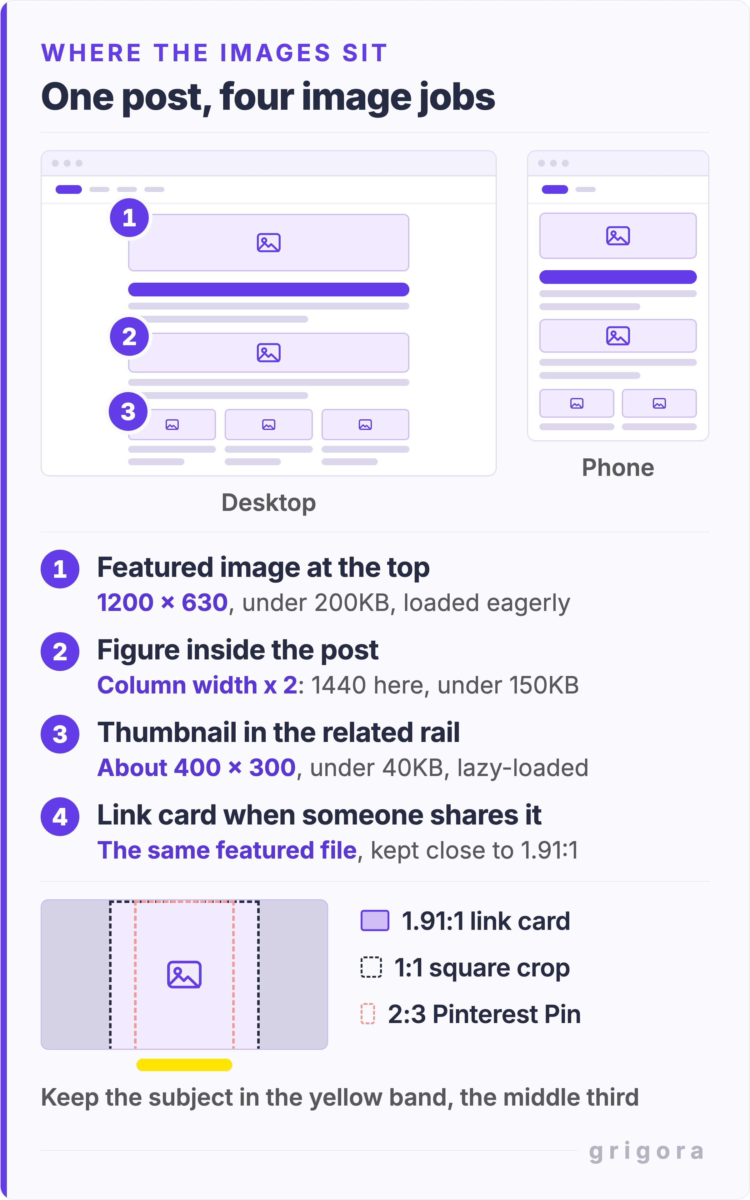
How wide should blog images be? Your column times two
1200px has a real origin: it is the width Meta asks for in an og:image and the width Google Discover recommends for a large preview. Both describe a card, not a figure halfway down an article. Copied across to in-post images, 1200 is right for exactly one layout: a 600px column on a 2x screen.
Published images are narrower than the advice assumes. The HTTP Archive's 2024 Media chapter measured the layout width of every image it crawled: the median img lands at 216 CSS px on desktop and 158px on mobile, and the widest image on a page reaches 680px at the desktop median. A 1200px file in a 216px slot carries about eight times the pixels a 2x screen can use.
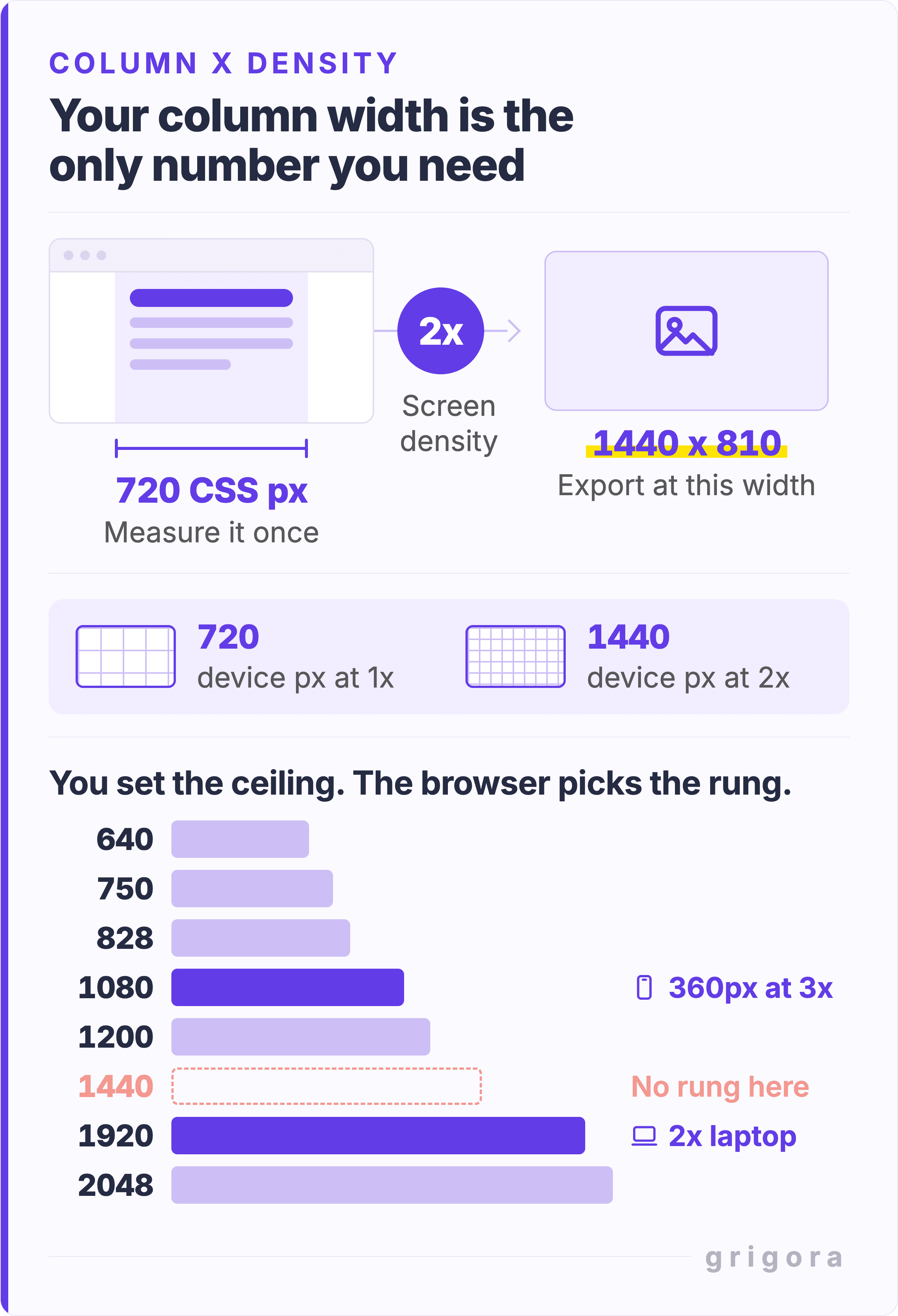
Find your content column width in 30 seconds
- Open one of your published posts in a desktop browser, window at full width.
- Right-click an in-post image and choose Inspect.
- Hover the
<img>in the elements panel. The tooltip gives the rendered size in CSS pixels. That number, not the size of the file you uploaded, is your column width. - Multiply by two. That is the widest source file the page will ever need.
This blog answers the question in its own markup. Every figure here ships with sizes="(max-width: 720px) 100vw, 720px" and a srcset of 640, 750, 828, 1080, 1200, 1920, 2048 and 3840px copies. A 360px phone at 3x asks for 1080 and gets it exactly. A 2x laptop wants 1440, the ladder has no 1440, so it takes the 1920 and scales down, downloading about 78% more pixels than it can show.
Why 2x is where you stop
Width and weight do not move together. Going from 1x to 2x doubles the width and quadruples the pixel count; a 3x export carries nine times the 1x pixels, more than twice the pixels of a 2x file for the same column. Phones do not need it either: a 390px phone at 3x needs 1170 pixels, which a 1440 source already covers.
How many KB should a blog post image be?
Under 150KB for a wide figure is a fair target and the wrong unit. What decides whether a post feels fast is the image weight of the whole page.
The 2025 Page Weight chapter of the HTTP Archive's Web Almanac splits its data by page type, and a blog post is an inner page. The median desktop inner page ships 442KB of images, the median mobile inner page 354KB. Home pages carry 1,058KB and 911KB, so a budget borrowed from home-page figures is more than twice as generous as a post can afford.
Spend that across the post, not per image. Eight figures at 150KB each is 1.2MB, nearly three times the desktop median. Eight at 40KB is 320KB; add a 120KB featured image and the post sits at the median. The same chapter's 8KB median image file is no guide, because it notes that tiny tracking pixels are counted as images. To find your own heaviest files, the broken image checker lists every image on a URL with its file size.
Lighter pages pass Core Web Vitals more often. Of mobile inner pages up to 1MB, 68% passed all three; at 5MB or more, 42% did. A good Largest Contentful Paint is 2.5 seconds or less for at least 75% of visits.
Do not wait for Lighthouse to complain. Since version 13 its image checks live in one Improve image delivery insight, which compares each download with an efficient bytes-per-pixel figure for its format and flags nothing that would save less than 4KiB. A quiet report does not mean every file is the right size, so check yours against the targets in the table above.
JPEG, PNG, WebP or AVIF: which format and when
I exported the same 1440 x 810 photograph four ways and weighed the files. JPEG at quality 90: 98KB. JPEG at quality 80: 41KB. WebP at quality 80: 17KB. AVIF at quality 55: 12KB. Only the export settings changed.
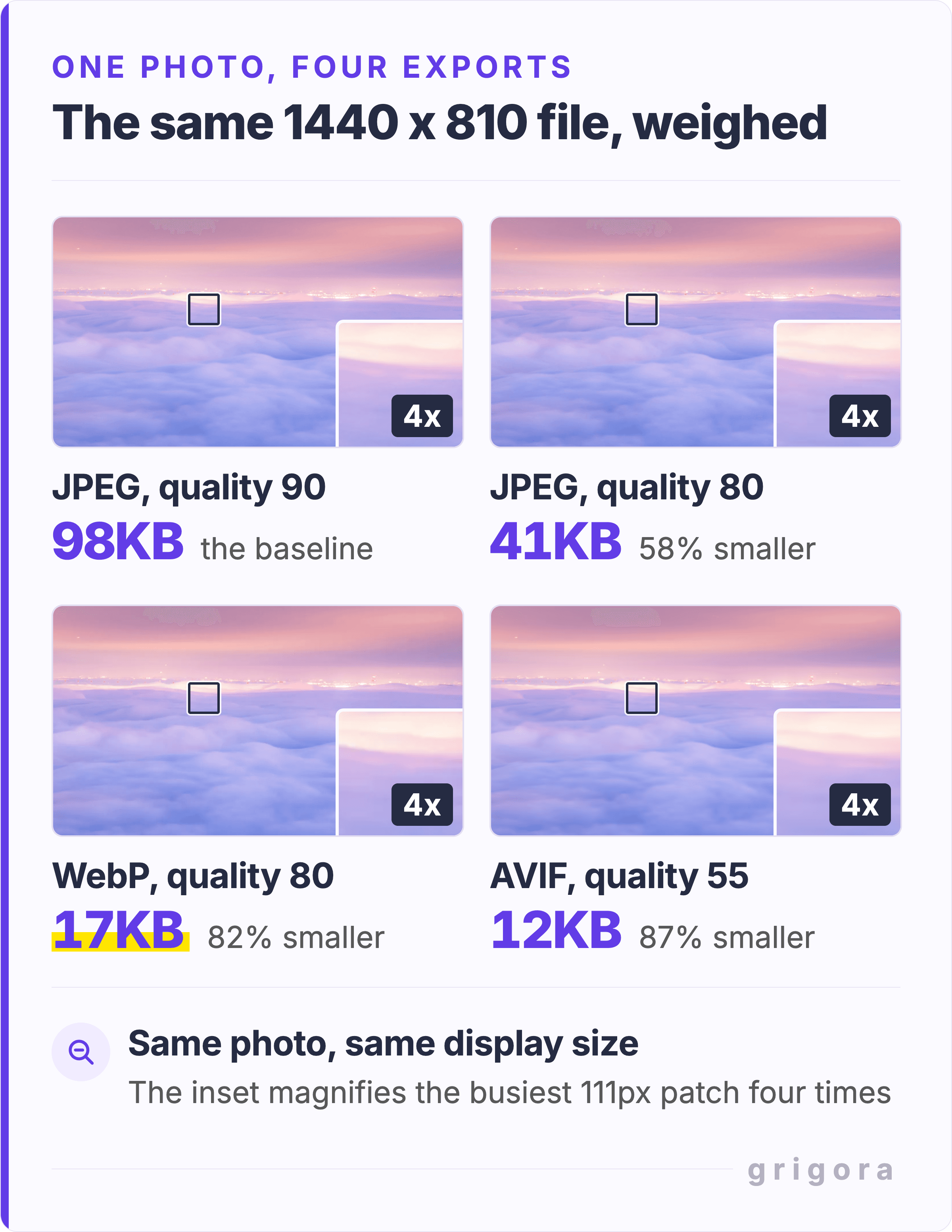
Then I ran the opposite kind of picture through the same four settings: a greenhouse packed with leaves, flowers and pots, at 1200 x 896. JPEG 90: 598KB. JPEG 80: 389KB. WebP 80: 374KB. AVIF 55: 315KB. Against JPEG 80, WebP saved 4% here and AVIF 19%; on the sky they had saved 58% and 70%. Fine detail is what costs bytes. Every format table you read, this one included, describes somebody else's pictures.
Published figures sit between my two photographs. Google puts lossy WebP at 25 to 34% smaller than JPEG at equal SSIM quality, and MDN puts lossy AVIF around 50% smaller. Across the web, the HTTP Archive's 2024 crawl found medians of 3.8 bits per pixel for PNG, 2.0 for JPEG, 1.4 for AVIF and 1.3 for WebP.
- WebP for almost everything. Photographs, illustrations, anything with transparency. It reaches about 96% of browsers in use (caniuse, checked September 2026), so a fallback is optional.
- AVIF when you want the smallest file. It came out smallest in both of my tests, and reaches about 95% of browsers, with full support since Chrome 85, Firefox 93 and Safari 16.4 (caniuse).
- PNG, or lossless WebP, for flat color and crisp text. A UI screenshot with hard edges is where lossless compression holds up, and Google measures lossless WebP at 26% smaller than PNG.
- SVG for anything drawn rather than photographed. Diagrams, charts, logos. One file, any density, no ladder.
- JPEG when something downstream cannot read the rest. Search is rarely that something: Google Search reads WebP, SVG and AVIF.
AVIF has one cost the compression tables never show: according to MDN, it has no progressive rendering, so the file has to arrive in full before any of it appears. MDN adds that the smaller file usually makes up for this, but that on large files the wait can become significant. Grigora's image to WebP converter turns a JPEG or PNG into WebP; for AVIF, use your editor's export dialog.
Also worth readingThe Ultimate Guide to End a Blog Post
Featured image size, and why 1200 x 630 keeps coming up
The featured image is the only picture doing two jobs, and the second one sets the size: it sits at the top of the article, and it is what appears when somebody shares the link.
Meta's guidance is where the number comes from. It asks for at least 1200 x 630 on high resolution devices, sets a hard minimum of 200 x 200, recommends staying close to 1.91:1 so the feed does not crop you, and caps the file at 8MB.
Google Discover recommends something slightly different: at least 1200px wide, more than 300,000 pixels in total, a 16x9 shape, and max-image-preview:large switched on. It crops the image itself when it has to, so keep the subject away from the edges. In Google's case study of 11 August 2021, the food blog Kirbie's Cravings reported click-through from Discover up 79% after turning that setting on. Discover's guidance adds three rules: no generic image, not your logo, and nothing text-heavy.
Grigora's custom OG image maker builds that card in the browser: fill in the title, tag, author, date and read time, pick a color or gradient, and the live preview is the card. It downloads as a PNG with no watermark at 2400 x 1260, twice the card size, so scale it to 1200 x 630 and compress it before it goes on the page.
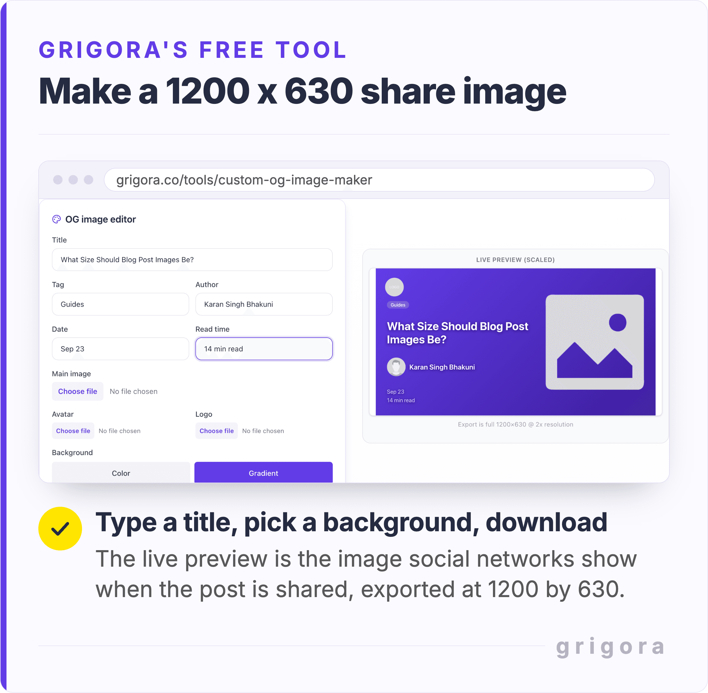
A card made mostly of words works in a chat preview, but it is the text-heavy kind of image Discover asks you to avoid. If Discover sends you readers, make the featured image a photograph. You will also recut that one file for other shapes. A square crop of a 1200 x 630 card keeps the middle 630px, and a Pin at the 2:3 Pinterest recommends keeps only the middle 420px, so anything near the left or right edge disappears. Keep the subject and any words in the middle third, then check what survives with the social image cropper.
The featured image finder shows which image a page offers for sharing. It reads og:image first, then twitter:image, then the first image in the page's structured data, then the first image on the page. If the cover came from somewhere else, read whether you can use any image on your website first.
Let the browser pick: srcset, sizes, width and height
You do not choose which file a reader downloads; the browser does. MDN's responsive images guide gives the order: read screen size, pixel density, zoom and network; find the first true media condition in sizes; take the slot width it names; load the srcset entry that matches, or the next one up. In MDN's own example that is a 63KB file instead of a 128KB one.
Adoption has grown; accuracy has not. srcset now appears on 42% of mobile pages, up from 34% two years earlier, but the median sizes attribute is 16% too large on mobile and 43% too large on desktop. The Media chapter estimates a quarter of desktop pages using width descriptors load 180KB or more of wasted image data because of it. If your figures sit in a fixed column, say so: sizes="(max-width: 720px) 100vw, 720px" beats a default 100vw on every desktop screen.
Then set width and height on every image, which only 32% of img elements on mobile do. web.dev is blunt about it: always include width and height size attributes, or reserve the space with CSS aspect-ratio. The browser takes the aspect ratio from those two numbers and holds the space open before the file lands, so text does not jump as images arrive. A good Cumulative Layout Shift score is 0.1 or less. The img attributes that do this are covered separately, and why a phone gets a different file from your laptop is the same mechanism at work.
Two mistakes that undo the rest
Lazy-loading the image at the top of the post. On 68% of mobile pages the LCP element contains an image, and 9.5% of those images carry loading="lazy". web.dev's instruction is one sentence: do not lazy-load images likely to be in the viewport when the page loads, especially LCP images. A lazy image cannot start downloading until the browser knows where it sits, so the file you needed first is the one you delayed.
Adding fetchpriority="high" on top does not undo it. The same page spells that out: an image with both attributes is still delayed while it is off-screen, then fetched at high priority once it is nearly in view. Take the lazy attribute off the featured image, leave it on everything below the fold.
Uploading whatever came out of the camera. A phone photograph is several thousand pixels wide, and a 720px column cannot use more than 1440 of them. Google's image documentation puts it plainly: images are often the largest contributor to overall page size. Resize before you upload, and rename the file while you are there. Google's own example is my-new-black-kitten.jpg over IMG00023.JPG; how to name image files for SEO covers the rest.
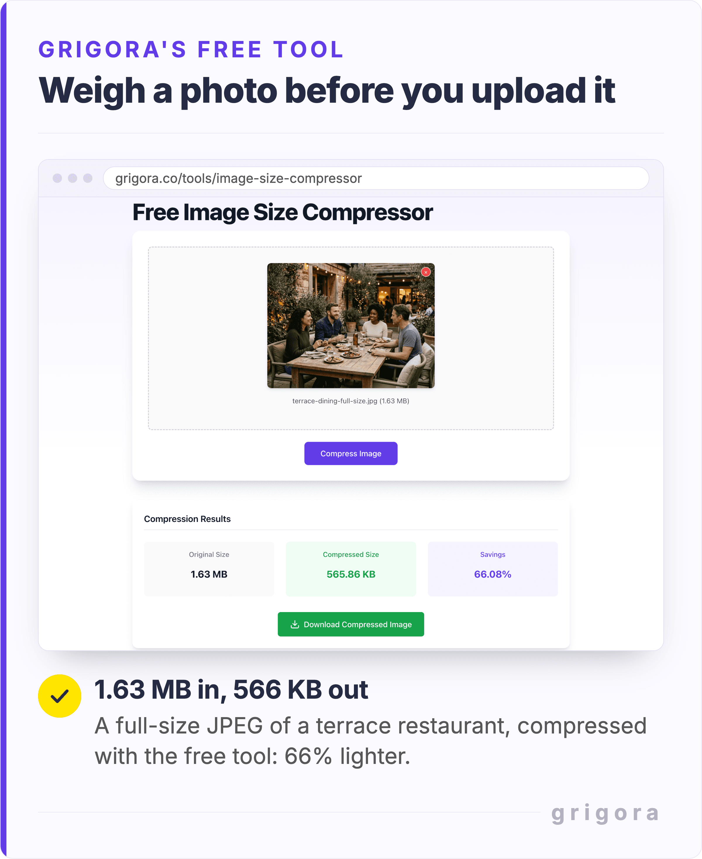
Compression gets you part of the way. The 566KB result from the Image Size Compressor is still almost four times the 150KB target for a figure, because the photograph is 3000 x 2240 and the compressor keeps every pixel. Resize it to 1440 wide first and the same compression starts from about a quarter of the pixels.
Does 72 DPI matter for blog images?
No. The DPI value a camera, a scanner or an export dialog writes into a JPEG or PNG is there for printing. Browsers lay the image out from its pixel dimensions. I changed the density field in the 1440 x 810 JPEG from earlier to 300 DPI and the file came back at the same 42,298 bytes, with identical pixels.
The reason is in the specifications. CSS Values and Units defines 1px as 1/96th of an inch and recommends anchoring screens to a reference pixel: the visual angle of one pixel on a 96dpi device at arm's length. The HTML standard lets a file's resolution change its displayed size only when a second EXIF field, PixelXDimension, has been written to match, so changing the DPI number alone never does it. What people usually mean by DPI is device pixel ratio, and a 2x export answers that.
How Grigora handles blog image sizes for you
Grigora is an all-in-one website builder: the site, the email and the store in one place. Every photograph you upload in the editor gets AVIF copies at up to six smaller widths, from 1920px down to 300px. An image block lists them in a srcset, so a phone downloads a small one, and writes width and height into the markup, so the space is held. The post featured-image block is plainer: it serves the file you uploaded, so that is the one to export at 1200 x 630 and compress first.
Three things stay with you. Images lazy-load by default, the one at the top included, so switch lazy loading off in your featured image's settings. Check that the cover still reads once it is recut square or as a Pin. And no encoder will tell you that a photograph is the wrong photograph. If you are starting from nothing, Grigora's AI website builder drafts a whole site from a description. The trial runs 14 days and needs no card.
Blog post image size FAQs
What is the best image size for a blog post?
Your content column width multiplied by two. Measure it by inspecting an in-post image and reading its rendered width in CSS pixels. A 720px column wants a 1440px file, a 640px column 1280px. There is no universal answer because there is no universal column.
How many KB should a blog post image be?
Under about 150KB for a wide in-post figure, under 200KB for the featured image and under 40KB for a thumbnail. Budget the page as well: the median inner page ships 442KB of images on desktop and 354KB on mobile (HTTP Archive, 2025), so eight 150KB figures come to nearly three times the desktop median.
Should blog images be 72 DPI or 300 DPI?
Neither. Browsers lay images out from their pixel dimensions, and the DPI number is there for print. Saving at 300 DPI does not make an image sharper on screen or change its file size; what matters is how many pixels wide it is.
Is 1920 x 1080 too big for a blog image?
For a figure in a normal column, yes. A 720px column needs 1440px at 2x, so 1920 carries about 78% more pixels than it can use. For a full-width hero it is a sensible size: at the 90th percentile the widest image on a desktop page paints at 1,905 CSS px, and srcset can hand smaller screens a smaller copy.
What size should a blog featured image be?
1200 x 630. That is what Meta asks for on high resolution devices, and its 1.91:1 shape shows in Meta's feed without cropping. It also meets Google Discover's recommended 1200px width, though Discover prefers 16x9 and crops the image itself, so keep the subject centered. Aim for under about 200KB.
Should I use JPEG, PNG or WebP for blog images?
WebP for almost everything, photographs included. It reaches about 96% of browsers in use, and Google measures lossy WebP at 25 to 34% smaller than JPEG at equal SSIM quality. Use AVIF when you want the smallest file, PNG or lossless WebP for screenshots with flat color and crisp text, and SVG for diagrams and logos.
What aspect ratio should blog post images be?
In-post figures have no required ratio: pick the one that suits the picture and keep it consistent through a post. The featured image is the exception at 1.91:1, the shape Meta's feed shows without cropping. Set width and height on every image so the browser reserves the right shape before the file arrives.
Do image dimensions affect SEO?
Indirectly. Google's image guidance favors sharp, high-quality images but warns that images are often the largest contributor to page size, so aim for sharp enough, then light. Discover recommends images at least 1200px wide for its large previews. And weight shows up in Core Web Vitals: 68% of mobile inner pages up to 1MB pass all three, against 42% at 5MB or more.
Practical writing on building a site, growing an audience and sending email people open. No more than one a week.
KS
Karan Singh Bhakuni
117 articles on the Grigora blog
More on Guides

Guides
Exact Price to Charge for a Blog Post
Introduction Nowadays people know the price of everything and the value of nothing. Oscar Wilde Why Blog Post Pricing Matters The importance of pricing your blog posts appropriately cannot be…
25 Oct 20239 min read

Guides
The Ultimate Guide to End a Blog Post
Introduction The end is the beginning, and the beginning is the end. This quote encapsulates the essence of why a strong conclusion is vital in blogging. While much attention is given to crafting…
17 Oct 20235 min read

Guides
11 Reasons Why it is Important to Post to a Blog Regularly
Introduction Consistency is not the key to success. Consistency is the key to change. Unknown The Significance of Consistency in Blogging In the ever-evolving landscape of digital content, blogging…
16 Oct 20237 min read